| Author | Thread |
|
|
04/28/2007 05:53:52 PM |
|
Comments Made During the Challenge  |
|
|
04/05/2003 02:02:36 PM |
|
good color I like the way you've arrainged thid photography 9 |
|
|
|
04/01/2003 08:14:46 PM |
|
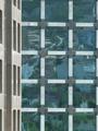
Nice example of symmetry. In my opinion, this shot could be improved mainly through different lighting (the top right corner seems kind of dark, and the main shadow takes some of the emphasis away from the main subject.) Also, while it is perfectly vertical, (I checked) the spacing at the top gives the impression that it it is not straight in the shot. Overall, quite nicely done! |
|
|
|
04/01/2003 02:38:40 PM |
|
|
|
04/01/2003 01:44:57 PM |
|
nice image, good lighting |
|
|
|
03/31/2003 01:55:15 PM |
|
I like the lighting in this photo. |
|
|
|
03/31/2003 01:52:55 PM |
|
Nice image and shadowing effects. The top of the photo is a little bit dark though. Good job. |
|
|
|
03/31/2003 12:11:31 PM |
|
|
|
03/31/2003 01:16:35 AM |
|
A little plain looking. ;) but nice. |
|
Home -
Challenges -
Community -
League -
Photos -
Cameras -
Lenses -
Learn -
Help -
Terms of Use -
Privacy -
Top ^
DPChallenge, and website content and design, Copyright © 2001-2026 Challenging Technologies, LLC.
All digital photo copyrights belong to the photographers and may not be used without permission.
Current Server Time: 07/27/2026 11:41:36 PM EDT.