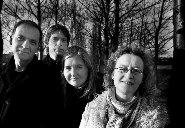
Shot using Sigma 15-30mm @ 15mm.
No additional light.
B&W conversion through green (66%) and red (34%) channels.
Levels.
Litle USM.
Blurred lumiosity layer with opacity ca. 40%
Doubled overlay layer with opacity ca. 40%.
Background dodging and litle burning and dodging of the faces.
Statistics
Place: 64 out of 251 Avg (all users): 5.9745 Avg (commenters): 7.1176 Avg (participants): 5.8333 Avg (non-participants): 6.1217 Views since voting: 1115 Views during voting: 326 Votes: 235 Comments: 19 Favorites: 1 (view)
When I clicked the CC button and your image came up, the first thing I thought was “WOW” great black and whites.
B&W still gives me problems, so I am always a bit envious about good black and whites.
The picture makes a good first impression, but by studying it a bit more there are some things that could be improved.
As stated somewhere the light on the faces, especially on your sisters face is a bit too much, and takes away some of the detail in her face. It also makes the faces look “hard” because of the stronger shadows on the other side of the face.
There is another thing that I noticed, it looks to me like there is a halo around the heads of the 2 guy’s at the left. It could be me, but it looks like something’s there.
There where some remarks about cropping, well I see another tree at the left side, and I would have wanted that more in the frame, then you could frame the photo with the two trees on the side, but it is always easy to make remarks after a picture has been taken.
I think you did a good job, I really like the Photo.
Keep up the good work.
Peter
If you have any questions, comments or other things about this critique, or are bored and want to spam someone just PM me
Ordinary and looking right at you! ;^) Very clean...did you use Neat Image, or is your camera just that good! Pretty good range on exposure and B/W's. Maybe a bit hot on the ladies cheek in the center. Overall, very nice.
those trees are so striking. I like how the tree on the right gives a frame but I think the slither of tree on the left should go. Its a shame that the whole family? isn't in focus.
The dark area on the right of the frame is really distracting - if you cropped that out I'm sure it would add significant to the image. Aside from that I really like the moment you have captured here. 6.
They may be ordinary but your photo is extraordinary! I suggest cropping out the right edge tree as it does not really improve the composition, IMO. Good exposure and clean post processing. 7






 Add photograph to your favorites
 Add photographer to your favorites

 Photographer found comment helpful.


