| Author | Thread |
Comments Made During the Challenge  |
|
|
04/19/2005 08:14:31 AM |
|
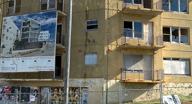
I like the idea behind this image, I don't think it is working the way it sould though. Maybe this is so because the sign is to close to the edge of the frame or maybe it is because the lighting on each side of the photograph is different. |
|
 Photographer found comment helpful. Photographer found comment helpful. |
|
|
04/16/2005 09:33:26 PM |
|
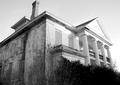
I like the touch of the new coming in to replace the old. Like the line of the light on the sun-facing side of the building as well. |
|
| Photographer found comment helpful. |
|
|
04/13/2005 08:41:34 PM |
|
Good clear focus. The banner tends to lead my vision to the left though. |
|
| Photographer found comment helpful. |
|
|
04/13/2005 04:19:12 PM |
|
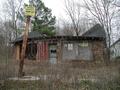
Gosh that looks abandoned |
|
| Photographer found comment helpful. |
|
|
04/13/2005 02:07:11 PM |
|
What a transformation THAT will be! This is really a good "abandoned building" picture. |
|
| Photographer found comment helpful. |
|
|
04/13/2005 01:33:22 PM |
|
I like this picture but maybe the crop is too tight? I want to see more building above the sign and all of the sign. |
|
| Photographer found comment helpful. |
Home -
Challenges -
Community -
League -
Photos -
Cameras -
Lenses -
Learn -
Help -
Terms of Use -
Privacy -
Top ^
DPChallenge, and website content and design, Copyright © 2001-2026 Challenging Technologies, LLC.
All digital photo copyrights belong to the photographers and may not be used without permission.
Current Server Time: 06/28/2026 01:05:44 AM EDT.