| Author | Thread |
Comments Made During the Challenge  |
|
|
04/18/2005 10:06:27 AM |
|
|
|
04/18/2005 01:43:51 AM |
|
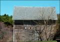
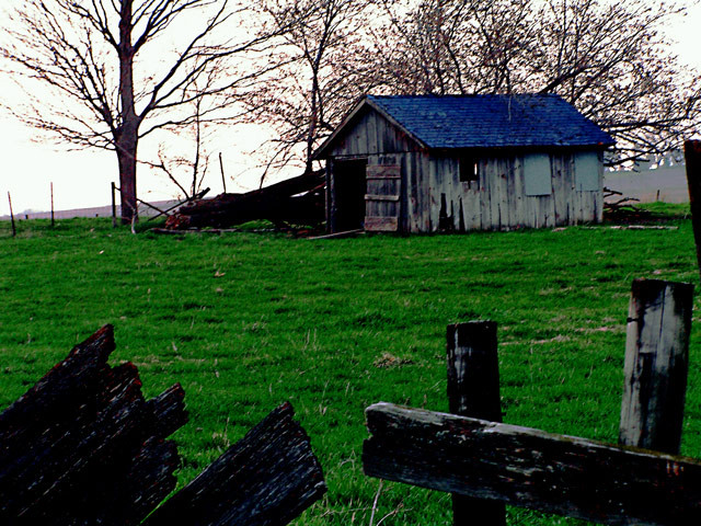
Interesting composition, but a bit too saturated and a bit odd on the detail (neat image?) in the right background and on the side of the building. |
|
|
|
04/17/2005 09:25:39 AM |
|
Although the compostion is not bad the photo is oversaturated and the light gives it a flat look. I might try shooting this again under different light conditions |
|
|
|
04/16/2005 09:06:00 PM |
|
This is a good shot IMO. Maybe to strong colours and contrast, but good shot nevertheless. |
|
|
|
04/16/2005 08:20:47 PM |
|
Don't know if you boosted saturation, but it looks cartoonish. |
|
|
|
04/16/2005 07:43:15 AM |
|
Good composition. The lighting isn't right though. The lack of light buried the detail in the structure. The fallen tree is just too dark. |
|
|
|
04/15/2005 10:26:42 PM |
|
over use of saturation ruins many a good photo. However very nice composition |
|
|
|
04/15/2005 05:34:34 PM |
|
Way too much saturation for me, good composition though. |
|
|
|
04/15/2005 03:14:21 PM |
|
This seems over processinged so colors are too saturated. |
|
|
|
04/14/2005 11:51:26 PM |
|
It seems a bit over sharpened and over saturated. Nice comp. |
|
|
|
04/14/2005 10:58:19 PM |
|
a bit too much color sat for my taste. It looks over processed |
|
|
|
04/14/2005 08:58:12 PM |
|
|
|
04/14/2005 02:31:21 PM |
|
I like that you used something in the foreground of this image. I would like to view this on my CRT as it has funny coloration on my laptop. Will return later to further comment. |
|
|
|
04/14/2005 10:36:52 AM |
|
Wierd saturation effects, detracts from the photo, IMO. |
|
|
|
04/14/2005 10:03:02 AM |
|
WOW way to mucy USM. The photo in my opinion is way to blurry or OoF but if the photo had more clarity would have made for an excellent shot. Good luck in this challenge. |
|
|
|
04/14/2005 10:00:34 AM |
|
The building seems to be out of focus to me, also the colors appear to be over-saturated in my opinion. |
|
|
|
04/13/2005 10:20:36 PM |
|
Colors are a little strange!! |
|
|
|
04/13/2005 12:16:25 PM |
|
|
|
04/13/2005 03:49:19 AM |
|
This is a bit too saturated... |
|
Home -
Challenges -
Community -
League -
Photos -
Cameras -
Lenses -
Learn -
Help -
Terms of Use -
Privacy -
Top ^
DPChallenge, and website content and design, Copyright © 2001-2026 Challenging Technologies, LLC.
All digital photo copyrights belong to the photographers and may not be used without permission.
Current Server Time: 06/27/2026 07:59:49 PM EDT.