| Author | Thread |
Comments Made During the Challenge  |
|
|
04/19/2005 11:20:53 PM |
|
Too soft and unhorizontal. Nice find though |
|
 Photographer found comment helpful. Photographer found comment helpful. |
|
|
04/19/2005 10:54:30 PM |
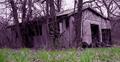
What is wrong with this picture? Here is an incomplete list:
a) The horizon is not level. You should have either fixed this in editing or be more careful at shooting time.
b) The picture is too soft. Either the focus is incorrect or you are using too slow shutter speed. A tripod would've helped here. Slight unsharp mask would be nice too (100 in amount, 0.3-0.4 in radius and 0 in threshod would probably help here).
c) The framing is not good enough. What is particularly irritating is that you've failed to include the leftmost part of the building. You might also have either tried to include more the surroundings or perhaps focused strictly on the door and the staircase - that might have been better.
d) The photo is much too grey. Try instead to take photographs when it's not as cloudy as is the case here and take them early in the morning when the sun is low on the sky. |
|
| Photographer found comment helpful. |
|
|
04/19/2005 05:48:53 PM |
|
The focus looks a little soft in this picture. Perhaps sharpening would help? |
|
| Photographer found comment helpful. |
|
|
04/19/2005 08:52:00 AM |
|
Seems out of focus and could use some straighing. |
|
| Photographer found comment helpful. |
|
|
04/18/2005 11:43:09 AM |
|
| Photographer found comment helpful. |
|
|
04/18/2005 03:49:18 AM |
If I may make a few suggestions:
1) Image needs a slight rotation CCW to bring it level.
2) Bring down the brightness a little and up on the contrast a little (10 pts or less each)
3) Needs sharpening (some excellent tutorials on site)
4) A slight saturation boost to bring a little vibrancy to it.
Keep in mind, these are my own personal opinions.
|
|
| Photographer found comment helpful. |
|
|
04/17/2005 06:01:08 PM |
|
| Photographer found comment helpful. |
|
|
04/14/2005 08:47:54 PM |
|
| Photographer found comment helpful. |
|
|
04/14/2005 08:26:32 PM |
|
the picture seems a little hazy |
|
| Photographer found comment helpful. |
|
|
04/14/2005 01:38:10 PM |
|
i don't know if it's just my screen, but the photo looks unfocused. |
|
| Photographer found comment helpful. |
|
|
04/14/2005 09:05:18 AM |
|
pretty good composition except i would have cropped more off the bottom so that the concrete wall were not in the image as it gives the feeling that the image is not straight. good subject. |
|
| Photographer found comment helpful. |
|
|
04/13/2005 10:24:25 PM |
|
Focus could be a bit sharper - picture seems to be slanting a bit. |
|
| Photographer found comment helpful. |
|
|
04/13/2005 12:26:51 PM |
|
Doesn't look to abandonded to me. IMO it appears fuzzy and lacks sharpness. |
|
|
|
04/13/2005 08:25:50 AM |
|
| Photographer found comment helpful. |
Home -
Challenges -
Community -
League -
Photos -
Cameras -
Lenses -
Learn -
Help -
Terms of Use -
Privacy -
Top ^
DPChallenge, and website content and design, Copyright © 2001-2026 Challenging Technologies, LLC.
All digital photo copyrights belong to the photographers and may not be used without permission.
Current Server Time: 07/17/2026 12:53:38 AM EDT.