Hi there from the Critique Club!
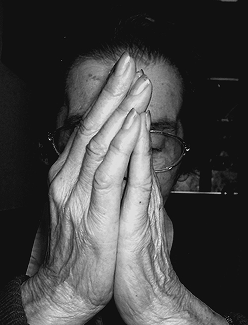
I do like the tones in this image and emphasising on the hands was a very good idea, but i think the symmetry should have been a little more dominant. I do like the concept of the usage of the hands and the composition is cropped quite well for the image used but the hands arent exact and i think that's why this image did score lower than hoped. if the hands were flatter showing more of her face on the left i think the symmetry would have been a little stronger ... i did not vote this week - but if i did i would have scored it a 6 for even just capturing the shot and the tonal range :)
Very nice image. Powerful as well with a great message. I like the black and white effect you used on the image. It makes the image more touching. Good job.






 Add photograph to your favorites
 Add photographer to your favorites


 Photographer found comment helpful.


