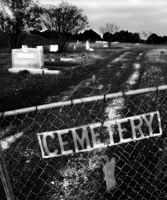
I didn't very much like the composition and the blowout cravestones doesn't make it more interesting either. I appreciate the effort, but I can't really get exicted about this.
I am making two passes on this Challenge. I will vote on your photo then return later(before voting is over) to comment on what I like and dislike about your shot. You can take the comments however you wish and I will try not to be mean. Just don't take it the wrong way.
--------------------------------------------------------------------------------------------------------------
Some of the whites look way overexposed. Like the headstone on the left.
unsure if you have gone down the burning and dodging route but it seems a little over-exposed and a little under-exposed in general, its just shouting out to me too dark and too bright. The Cemetery text on the gate is a great capture none the less and a well eyed up composition but the horizon looks like a slight tilt to the left could really help out. good job. :0)
I love the crooked gate and the little angel. I love the way the road leads us into the photo, even though there's nothing at the end of it. The editing effects call attention to themselves, but they do make the photo.





 Add photograph to your favorites
 Add photographer to your favorites


 Photographer found comment helpful.


