| Author | Thread |
|
|
03/30/2005 05:46:35 AM |
Greetings from the Critique Club
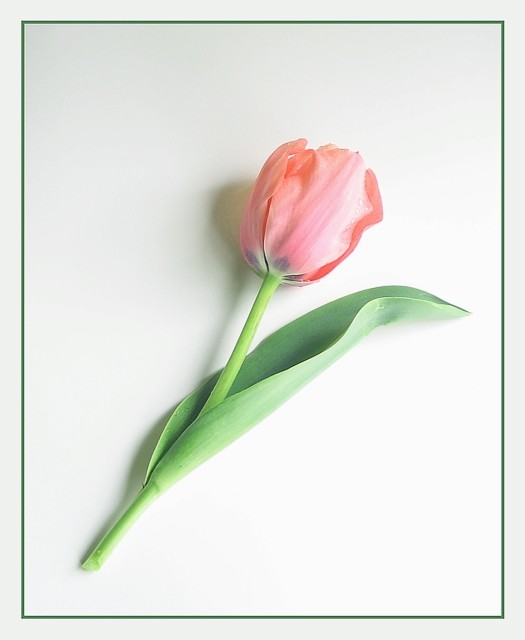
The first thing that strikes me about this photo is the gentle simplicity of it. The soft pastel-like colours give it a texture you can almost feel. The shadow underneath enhances the appearance of depth. The white background is most appropriate for the subject matter. The green border is a nice touch that matches the stem of the flower. All in all an excellent composition and I cant find anything I would change about it. |
|
 Photographer found comment helpful. Photographer found comment helpful. |
Comments Made During the Challenge  |
|
|
03/27/2005 06:10:37 PM |
|
Very nice, I like the soft shadow. |
|
|
|
03/27/2005 02:24:46 AM |
|
|
|
03/27/2005 12:44:33 AM |
|
Nice. Very soft and great white background. A littel harsh on the side light. |
|
|
|
03/26/2005 08:29:41 PM |
|
Delicate, soft and beautiful. Flowers, especially ones captured like this are always in demand. |
|
|
|
03/26/2005 10:14:59 AM |
|
simple, simple, simple. clean and clear. soft and inviting. border is tastefully done. Top 10 for me. |
|
|
|
03/25/2005 09:17:10 AM |
|
I love the simplicity of this shot, very nice! |
|
|
|
03/24/2005 10:03:51 AM |
|
Nice subtle shot...would prefer without the border. Good Luck. |
|
|
|
03/24/2005 05:55:35 AM |
|
Soft and delicate and the frame is very nice.... |
|
|
|
03/23/2005 12:39:30 PM |
|
I think for this kind of shot to work, it either needs no shadows or a very dramatic shadow. This has an average shadow and looks a bit faded to me. |
|
|
|
03/23/2005 04:46:48 AM |
|
I would be incredibly surprised if I don't see this on a greeting card in 6 months time. My one and only ten for the challenge - as most saleable image. |
|
|
|
03/21/2005 07:07:51 PM |
|
It's a really lovely photo and it is lovely art. Since I do not have graphic design background I find myself less enamored of photos with vast white spaces. And my curiosity is aroused about whether it has crossed the threshold from photo to digital art when over 15% of the area of the 'photo' is art. This is certainly one of the more impactful images in this challenge, yet I would have strong reservations about asserting it is the best photo. |
|
|
|
03/21/2005 05:24:53 PM |
|
i wish you color was more saturated |
|
|
|
03/21/2005 03:53:55 PM |
|
Beautiful soft picture. Perfect border. Good Job. |
|
|
|
03/21/2005 12:27:03 PM |
|
|
|
03/21/2005 03:59:40 AM |
|
Great shot, it just seems a little too bright on the right of the photo (the light source). |
|
|
|
03/21/2005 12:44:16 AM |
|
Would've looked better uncut |
|
Home -
Challenges -
Community -
League -
Photos -
Cameras -
Lenses -
Learn -
Help -
Terms of Use -
Privacy -
Top ^
DPChallenge, and website content and design, Copyright © 2001-2026 Challenging Technologies, LLC.
All digital photo copyrights belong to the photographers and may not be used without permission.
Current Server Time: 07/02/2026 08:55:09 AM EDT.