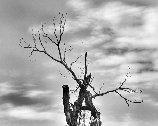
For some reason a Tim Burton film comes to mind when I look at this tree. :)
Would personally love to see either the full tree or if moved closer, to se more detail, because what I am able to see, I like.
I agree with Rob, maybe shifted one way or the other would make it pop more for me. As far as colors go, the contrast of light and dark is there, but I would like to see the sky play into the image more, since it is a prominent feature. Would love to see this image processed and made to shine even more than it does. :)
-Christine
good range from black to white while limiting the "blown out" areas. i like the rule of thirds for the composition, but it could even be shifted left or right even more to break up the balance a bit.
a little more detail in the clouds and the bark would help as well. i think there are more tones in this that we can improve upon.
Full range of tones so I don't miss the color in the shot. I'm wanting to get closer to the "deadwood" and somehow I connect this with the B&W treatment. It's as if I'm wanting to see more of the tree detail? Maybe it's because the light gray sky is blurry and the tree is the main subject according to the title? I find the dark and light sky a standout - defineatly a powerful element in the shot.
I like how this looks like a stag's antlers, but feel that if the sky were a bit darker in the top left and bottom right it would really frame the tree well.





 Add photograph to your favorites
 Add photographer to your favorites

 Photographer found comment helpful.


