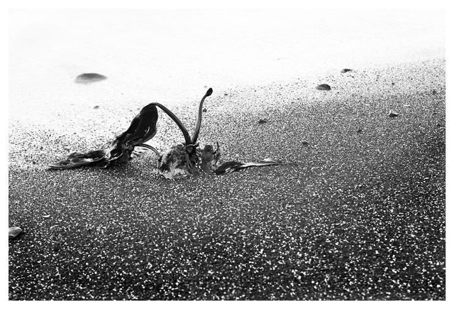
I really like this photo; but I'm not able to connect it to AA's work. (quibble; that stone on the left edge would normally not matter much, but it is one of half a dozen identifiable objects in the photo, so I find it's placement distracting.
Good idea and framed properly according to the rule of thirds. This image is more high key than it is Ansel Adams style but that did not bother me. It suffers from what most of my digital images suffer from... It looks both oversharpened and out of focus at the same time when there is a lot of fine detail like in the sand. It is made worse in a demanding challenge like this one. The top of the frame is washed out and makes you wonder more what was missed than it does enhancing the main subject. (Score: 5)





 Add photograph to your favorites
 Add photographer to your favorites


 Photographer found comment helpful.


