Critique Club
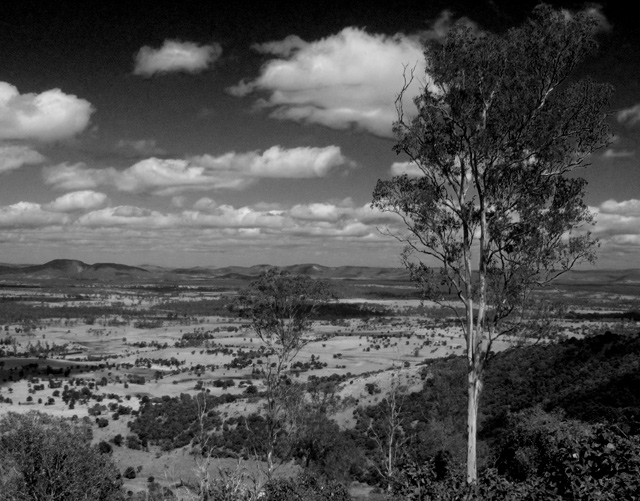
Heavy, i think that you nailed the tones that Ansel Adams had in his photos. however I think that you are lacking his eye for the landscape scene. While you picture is very nice, I think it could be improved. The sky is the most fasinating part of the picture, the land is a bit boring to me. And your perspective is at eye level which can take away from the scene. Everyone is so used to seeing at this angle that when new angles are introduced through photographs it becomes more intesting to the eye. Your photo is also split down the middle with the horizon right at the center. I would have like to see you shoot from ground level and have the horizon in the bottom thrid of your photograph. This would not only make your tree feel larger than life, but it would give you more of the dramatic sky. I like that you place the tree off centered. Overall, I think you did a good job, when you go out make sure you shoot from different angles and try to keep your horizon out of the center. Good job on tones!
Revisiting and explaining my lower scores - I hope to be helpful, not insulting.
I only rated this a 4 because this is a decent shot of a beautiful view, but the foreground is somewhat blurry and indistinct, and that doesn't portray Ansel's style to me. You've done a nice job with the overall tonality, so I'm bumping you to a 5. Best of luck!
Composition: 5, I think that maybe taking the horizon out of the exact center would help this shot
Technical: 6
Appeal: 5, The clouds are pretty interesting, but the foreground is pretty barren. Possibly crouching down and using 2/3 of the shot for the sky, and only 1/3 for the ground
Challenge: 7, Excellent dark sky, just as quite a few shot's Ansel has made. Good full tone range
Overall Calculated Average Score: 6






 Add photograph to your favorites
 Add photographer to your favorites

 Photographer found comment helpful.


