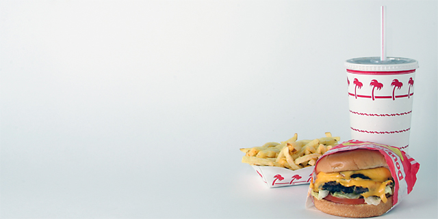
Had to take this quick as it was my dinner and I was HUNGRY! I wasn't going to submit this as I didn't really like it too much, but thought what the heck 5 minutes before deadline.
Crop, USM, levels (just on the fries to make them more yellow), cloned out some dust spots, Save for web.
Lens used: Canon 28-135 IS
Statistics
Place: 31 out of 148 Avg (all users): 6.1028 Avg (commenters): 7.5714 Avg (participants): 5.8889 Avg (non-participants): 6.2581 Views since voting: 1526 Views during voting: 381 Votes: 214 Comments: 17 Favorites: 0
Of course, that's the best! You must've been a regular at In-N-Out to know that. Good stuff! If you're ever down in LA, try Tommy's for REALLY good chili burgers/fries/dogs. *Not for the health-conscious!
nice shot I love it, gotta get me an In N Out burger after this. One quick question. How do you get the white background or the black background? Is it through photoshop or a white/black piece of frabric
I like this one but I think I'd like it better with a different background. The negative space is good, but the solid white is kinda boring. With the palm tree print on the packaging, I picture these sitting on a picnic table with a backdrop of blue ocean and sky -- still largely monotone and empty but less dull. Maybe that would work, maybe not. Just an idea...
That melty cheese is making me hungry. Proves it is an effective ad!!
My evaluation method of this challenge is as follows:
1. Did you catch my eye while I was driving by? Yes.
2. If I didn't catch the text while I was driving, did you intrigue me enough to look for this billboard again? No.
3. Did you sell your stuff to me? Only if I'm hungry.
4. Extra thoughts: The use of negative space is nice and the details of the photo are good. The whites are nicely balanced.
The lighting is flat and I don't like the huge reflection of the light at the center top of the photo.
the DOF is a bit too shallow and over all there's nothing new and exciting about this billboard. Just another one I pass on my way and forget a minute later. (5)
ok, i am voting this challenge in 2 passes. in this pass, you will get a partial comment and a score. then i will come back to comment again. if you have any problem whatsoever with this comment, pm me and let me know. otherwise, take it with a grain of salt...i'm not trying to be a know-it-all, i'm just explaining where i'm coming from in voting this challenge. and, if this comment is NOT helpful (of if you think i'm full of $#!+), don't mark it helpful.
billboards are a science unto themselves. a lot of research has gone into determining just how much information a person can digest and retain in specific time spans. they use this information to develop formulas for determining the number of words and letters to use on billboards, as well as their sizes. they also determine the size and number of visual elements to include.
the graphics/photograph on a billboard are designed to get the point across in a moment. on the road, a driver will have less time with a billboard than a voter will give your image. this is a key element in the challenge: composing a shot that will get its point across quickly and succintly. along those lines, a strong composition will probably have few details and make strong use of negative space.
----------------------
this is a perfect idea for a billboard, but for it to really work, there are a couple things you would need to do differently. your subject looks great up close, but is too small to really come across at 60 mph (this is one challenge where you have to look at the thumbnails to get a feeling for what it would look like on the road...well, looking at the thumbs is easier than putting the pc out in the yard and running back and forth.). another consideration is that the more effective billboards are laid out from left to right, with the graphics on the left and the verbiage on the right. all the same, you have an image that gets the point across. good luck in the challenge!







 Add photograph to your favorites
 Add photographer to your favorites


 Photographer found comment helpful.


