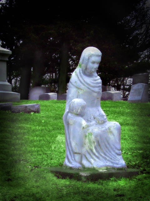
I tried something a little different for this one. I know some people don't like the soft or blurry feel but I do so I tried it out. Hopefully it doesn't suck as much as my last ones, well I gues I am learning something either way.
Statistics
Place: 171 out of 182 Avg (all users): 4.3665 Avg (commenters): 3.8571 Avg (participants): 4.0600 Avg (non-participants): 4.6198 Views since voting: 666 Views during voting: 352 Votes: 221 Comments: 8 Favorites: 0
This evokes a sadness in me. The green is just too dominate, though, because it pulls my eyes very strongly. Maybe a touch too much burned vignetting, too. 5
I like the effect you were going for with the dark ring aroung the shot.. But it just seems a little off too me. In the back beside the tombstone on the left there is softhing the looks weird. It is either a bad sunspot or another stone I can't tell wich. I do however enjot the soft feel of the photo and the painted look it has.
The subject fine, I think it's let down by post processing the left hand border has a very symetrical pattern in the grass as if its been cloned in stripes from the base of the statue all the way to the stones above, and the subject could maybe do with some greater contrast and sharpness to bring out the features... Good Luck







 Add photograph to your favorites
 Add photographer to your favorites


 Photographer found comment helpful.