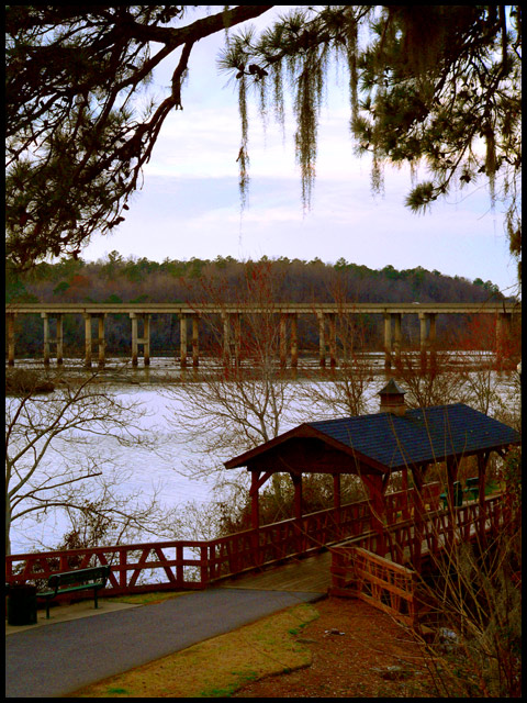
Since this was 'Bridges II challenge' I decided to have two bridges in the photograph. I was going to name it 'Two Bridges' but I know some vote down if the title includes the name of the challenge.
I liked this POV because to me it conveyed a peaceful to just walk or sit and think things out as you watch the world go by on the interstate highway above. Sometimes we just need to slow down and enjoy life. Hope you like it.
-------------------------------------------------
Processing:
1. No crop
2. Auto levels
3. Auto contrast
4. Auto color
5. Duplicate layer
6. Desaturate Duplicate layer
7. Invert duplicate layer
8. Filter duplicate layer > blur > gassulin blur set at 30%
9. Blend mode > normal set at 25%
10. Flatten layers
11. Auto levels
12. Auto contrast
13. Auto color
14. Color adjustment
15. Resize to 640x480
16. Inserted a black border at 10 pixels
Statistics
Place: 233 out of 424 Avg (all users): 5.1779 Avg (commenters): 6.1667 Avg (participants): 5.0185 Avg (non-participants): 5.3354 Views since voting: 1215 Views during voting: 421 Votes: 326 Comments: 8 Favorites: 0
Actually I would have liked the title "two bridges" - it's a clever play on the challenge title and it describes the image.
This is an excellently chosen scene. Well framed at the top and with good, interesting subjects for the eye to land on. I find my eye going back and forth between the two bridges.
There is a colour problem with this image, There's a clear red/brown cast to all the midtones and it's just visible in some of the sky highlights. And again there's a grainy lack of detail that I'm starting to suspect is down to your camera.
Lovely composition, but the contrast is just too wide for my poor crt to handle. If you could spot edit to get more detail in the shadows while getting detail in the highlights it would jump 2 or 3 points. I love the old/new comparision
Fantastic composition, I really like how you've framed these two bridges. Focus could be a little sharper, but it's not bad, however the one thing that's holding this image back is the color. Looks as if the saturation has been pushed too far. If you can resolve the color issue I think you might have great photo here. Good luck
The more modern bridge really spoils a great view. I like the vertical crop, bringing in the tree limb. Works really well with the covered bridge. Focusing on the smaller bridge, blurring the background would help a lot, I think.






 Add photograph to your favorites
 Add photographer to your favorites

 Photographer found comment helpful.


