| Author | Thread |
Comments Made During the Challenge  |
|
|
02/22/2005 12:19:02 AM |
|
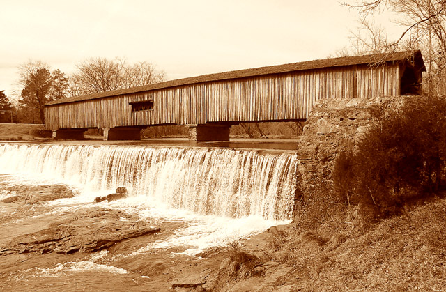
I really like this shot. A nice pleasant composition with a rustic feel. It is composed well, even with the waterfall (a nice secondary subject) and foreground, trees and sky and such, the bridge still is made a very strong focal point. I find my eye wandering along the texture and lines of the bridge, and then travels back along the waterfall again in a pleasing loop. I don't think the sepia 'tone' takes anything away, but I am wondering if perhaps all the texture in the shot would be even stronger in straight b/w? Anyways, a very nice shot IMO. |
|
 Photographer found comment helpful. Photographer found comment helpful. |
|
|
02/20/2005 12:21:20 AM |
|
Very nice bridge. I would like to see it in b&w too |
|
| Photographer found comment helpful. |
|
|
02/19/2005 11:19:30 AM |
|
This bridge is at Watson Mill isn't it?? I was taking pictures of this bridge about a month ago. :) Like your shot of it! |
|
| Photographer found comment helpful. |
|
|
02/19/2005 03:25:54 AM |
|
I don't know if the sepia works well with this photograph for me. Maybe black and white would of been better. I seem to feel emotion in Sepia and 'old' in black and white. But still a good photograph 6 |
|
| Photographer found comment helpful. |
|
|
02/18/2005 04:17:24 PM |
|
Sepia works well here. Interesting subject bridge. |
|
| Photographer found comment helpful. |
|
|
02/18/2005 12:37:21 PM |
|
To me, the featureless sky spoils the overall effect. The main subject is nice and sharp, but the water on the left looks a bit overexposed. |
|
| Photographer found comment helpful. |
|
|
02/18/2005 08:26:58 AM |
|
Beautiful tone. Unlike many of the other monochrome shots this actually looks like it could have come from b&w film. |
|
| Photographer found comment helpful. |
|
|
02/18/2005 02:16:56 AM |
|
Lovely sepia duotone for this covered bridge. You have my covered bridge shot beat hands down! I love the symmetry of the bridge siding and the spillway lines. Best of luck! |
|
| Photographer found comment helpful. |
|
|
02/17/2005 08:03:11 AM |
|
Very nice use of colour. Do you have any shots with a longer exposer to 'silk' the water? |
|
| Photographer found comment helpful. |
|
|
02/17/2005 04:56:50 AM |
|
| Photographer found comment helpful. |
|
|
02/16/2005 10:42:43 PM |
|
Just a touch bright, but other than that, nearly perfect! 9 |
|
| Photographer found comment helpful. |
|
|
02/16/2005 01:13:48 PM |
|
nice shot. i would have desaturated it a bit. |
|
| Photographer found comment helpful. |
|
|
02/16/2005 01:06:12 PM |
|
The sepia tone is great for this photo. |
|
| Photographer found comment helpful. |
|
|
02/16/2005 11:13:38 AM |
|
very interesting bridge, wish it was in color |
|
| Photographer found comment helpful. |
|
|
02/16/2005 10:01:35 AM |
|
Nice tones and presentation! |
|
| Photographer found comment helpful. |
|
|
02/16/2005 01:55:23 AM |
not bad...I think the bush and stone in the foreground right are a little distracting, and I'd probably bring the exposure down a bit....but I do like the contrast between strong horizontals and verticals.
-5 |
|
| Photographer found comment helpful. |
Home -
Challenges -
Community -
League -
Photos -
Cameras -
Lenses -
Learn -
Help -
Terms of Use -
Privacy -
Top ^
DPChallenge, and website content and design, Copyright © 2001-2026 Challenging Technologies, LLC.
All digital photo copyrights belong to the photographers and may not be used without permission.
Current Server Time: 06/30/2026 07:09:20 PM EDT.