Here's an outtake which is a more "normal" shot of me. 2nd choice for the challenge as well:
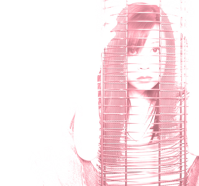
I'm happy I went with something different and artsy, even if it doesn't necessarily show me in a flattering light... but.. not going for score, just fun :)
Big kudos to all the amazing portrait photographers on this site who have mastered lighting technique. I was never totally satisfied with the lighting effect for any of my headshots. One day I'll get a clue on how to do it properly.
Statistics
Place: 50 out of 247 Avg (all users): 6.1988 Avg (commenters): 7.6000 Avg (participants): 6.2632 Avg (non-participants): 6.1412 Views since voting: 2006 Views during voting: 702 Votes: 322 Comments: 32 Favorites: 5 (view)
I like the toning here. Makes this unique and different.
I am not too crazy about your expression, but I find this image interesting enough to make up for that.
Nice work.
A very nice image though i doubt that DPC is ready for it. It is more a graphical reprentation and these images do invite the famous bell curve.
As a a graphical art study it is great because it chooses to lean on the understatement with a nice soothing tint. Of course, the beauty of the subject begs the conventional full tonal values to appreciate it even more.
Well, I am a graphical artist and find this image very endearing, Bumping up to 7
Oh the things you can do with a cd rack. that is a cd rack? i like this it is different. Wish I could see a little more of the knees and it had a tiny bit more contrast but that is just me. well done.
Kudos for the composition and unusual approach (and your model is great). I like the way your arm is defined by the negative space. The high key image seems a little washed out, though. I'd like to see a more depth in the shadows to keep the shot from looking flat.





 Add photograph to your favorites
 Add photographer to your favorites


 Photographer found comment helpful.


