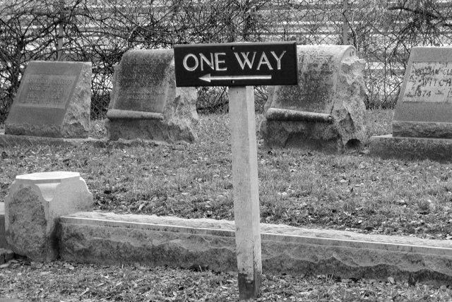
Visually, beyond the joke, it's a little flat. A lot of the background seems like the same shade of gray, probably due to the lighting/time of day? Great observation, though - it made me chuckle - and extra points for not being a "structural" bridge (which is more than I can say for my shot ....).
I like the composition. Title doesn't quite fit for me, although I do "get" what you're going for. Another angle (higher?) might work better, getting rid of what looks like a freeway in the background. Would like to be able to read the stones a little better, too. I'm sounding critical, but I like the shot.
Original concept. I like it. The only thing is the sign is not parallel. My personal preference is either make the sign paralell, or make it even more crooked.
Interesting take on this challenge. I would have liked to see just a tad more contrast, and I think this could have been a bit more appealing if the sign were not quite so centered, but this is a nice picture nonetheless. The textures here are excellent, and the approach is unique.






 Add photograph to your favorites
 Add photographer to your favorites


 Photographer found comment helpful.


