I am still going back through my hard drive, deleting what I won't ever work on, and trying to finish the shots I never finished processing. (Yes, I have backups of the ones I'm deleting).
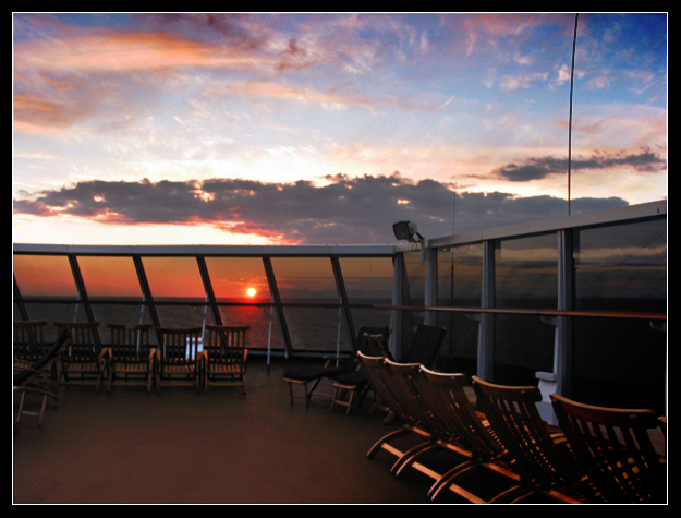
This one is from my Alaska trip a year ago August, and the balance of light just wasn't right, so I've tried to balance it appealingly in PS using levels with gradient masks on layers.
I like the scene, though somehow I am not sure it's enough to be attractive to people and so I am asking.
You can just respond here, but up to the first 10 people who leave a constructive comment on the photo, and a link to a photo in your portfolio you want critiqued, I will visit that photo over the weekend and return the favor. I am limiting it to 10 because, if this works out, I will have other photos too, and I want to have time to both finish them and do the same "trade" for honest critiques.
Disclaimer: I am looking for honest critiques. And if you put a link to one of your photos, I will also give you an honest critique.
I really like the colours and feeling of the image. The composition isn't as interesting as it could have been - perhaps more emphasis of the line of chairs on the right converging with the line at the front, mirroring the railings. I would clone out the arials and the lamp on the railings also. I still find it a pleasing photo, and the exposure is just right to get the sky detail and soft colour reflections on the deck and chairs.
Neil, this is the type of shot I just love, but most people just don't see what I see. The softness is something I actually like; I like the "painted" effect and it carries on with the mood of the setting. I adore settings like this that have a great flow for the eye, great colors and tones, but not one specific "subject". I am not going to ask for your kind offer of reciprocation, but I would love your take on a couple of mine that I think are similar in ways to this - someday when you have the time and remember.
Brian, I think you're right. I was so busy fixing the brightness levels I didn't check the horizon. I'm not sure what you mean by hot spot under the sun--you mean the base of the post you can see through the chairs? If so, yes, I see it, I should probably clone that out. But let me know if you mean something else.
Hey NEil,
I really am not doing this for a critique, just because I LOVE your photography. Like you noe shooting portraits, I don't shoot too many landscapes, so this is just by what I see.......My first impression was that the horizon line was crooked, although I dont think it is? Optical illusion? I LOVE your color and feel of the shot, but my MAIN distraction is the hot spot to the bottom left of the sun. Overall i Think its nice, and would LOVE to be there now!
Lyn, how much are you suggesting to crop? (probably fits in with Robert's suggestion about the split line--I thought about that, but I thought the perspective/chairs/foreground was adding so I didn't know how much to take off?)
I would say there are positives and negatives about the photo. The quality of light is very nice. The sky is nice, the sun looks good, and the light on the deck, especially in the chairs is nice.
I think the composition could have been a bit better if perhaps the railing didn't split the photo right down the middle. I also think that to make this look fantastic, it probably would have had to have been on a tripod. It's just a bit too soft in some places. It's nice looking though, a keeper.
I think it needs to have some cropped off the right and bottom if is going to be pleasing in my mind. I would also clone out that tall line on the right that goes to the top of the shot and then see what you think. : )