Author Thread Comments Made During the Challenge
Post actions
Post actions
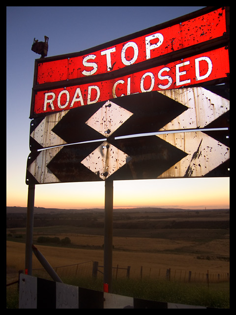
You lose a little in the loss of colour intensity at the bottom of the shot. If it had been cropped Just under the horizon (probably the same distance as is between the botom of the sign and the horizon), it would have kept the high impact colour saturation and grittines of the ageing sign that first attracted me. The field is just a little too soft (iin colour and composition) to do the focus of the picture justice. I like the shot though... Nicely done.
Post actions
good colour and exposure 9
Post actions
Lovely bright colours - fill flash on the sign?
Post actions
Post actions
Post actions
All the elements come together in this photo. The light and dark and the colors all compliment each other
Post actions
Weathered sign and wonderful scenery all in one image. Great shot!
Post actions
I think a straight on shot might have been boring... but I am not sure if this angle is working for me either. 7
Post actions
Rich and controlled sense of color and space. The heavy border is not helping the image iMO. Strong entry.
Post actions
Great colors. Border is a bit heavy for my tastes. 7
Post actions
Very nice. Good exposure and interesting looking sign. Should place highly.






 Add photograph to your favorites
 Add photographer to your favorites


 Photographer found comment helpful.


