| Author | Thread |
Comments Made During the Challenge  |
|
|
02/07/2005 03:44:20 PM |
|
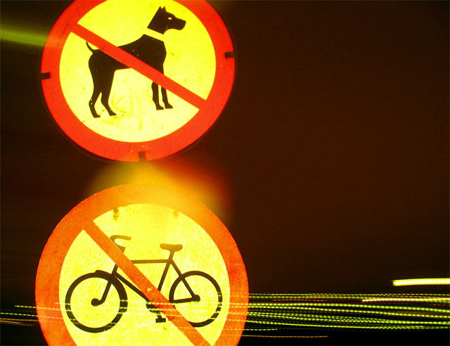
Too blurry. Not a very good picture. Not very interesting. Sorry. |
|
 Photographer found comment helpful. Photographer found comment helpful. |
|
|
02/05/2005 03:59:15 AM |
|
I find the blurred patch of light between the signs to be a bit distracting. I quite like the picture, though. |
|
| Photographer found comment helpful. |
|
|
02/02/2005 04:30:45 PM |
|
Curious, yet interesting composition. The bright yellow works great. Might even be better if the black was more intensified. |
|
| Photographer found comment helpful. |
|
|
02/02/2005 09:00:59 AM |
Looks like the white balance is slightly out here.
Not keen on the glare. Good idea but would have liked to see the signs fully, not chopped off. |
|
| Photographer found comment helpful. |
Home -
Challenges -
Community -
League -
Photos -
Cameras -
Lenses -
Learn -
Help -
Terms of Use -
Privacy -
Top ^
DPChallenge, and website content and design, Copyright © 2001-2026 Challenging Technologies, LLC.
All digital photo copyrights belong to the photographers and may not be used without permission.
Current Server Time: 06/30/2026 01:19:59 AM EDT.