|
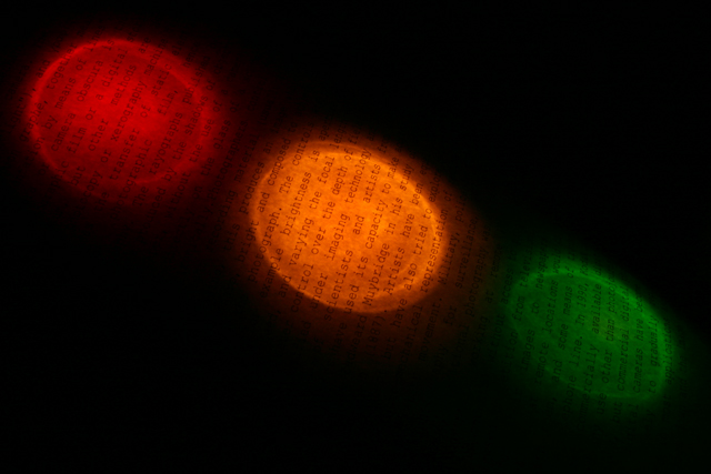
As a thumbnail one couldn't see the writing, but now it's obvious. Green doesn't have the intensity of the others and red is a bit dimmer as well, but idea is great and execution, while not perfect, supports it well. I especially like the caustics on the light and the fact you didn't use just simple paper. |







 Add photograph to your favorites
 Add photographer to your favorites


 Photographer found comment helpful.
