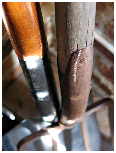
First look at the image doesn't really tell what's going on here as the subject is not that clear with the angle you chose. The title is interesting and attracts the viewer to give it a closer look.
Lighting is too harsh and the blown out areas are distracting. Looks like you are using natural light coming from some sort of door or window for the lighting. you could use a more diffused light by not letting the sunrays fall directly on to the subject.
Blur of the subject is not helping it in any manner and a deeper DOF would be better.
Overall, a great idea but needs some improvement in the way its shot.
If you have any questions, feel free to pm me.
-Gaurawa





 Add photograph to your favorites
 Add photographer to your favorites

 Photographer found comment helpful.


