| Author | Thread |
|
|
10/15/2025 10:08:48 PM |
|
 Photographer found comment helpful. Photographer found comment helpful. |
|
|
11/27/2006 06:54:52 AM |
Thanks for the comments! I see what you mean! Frustrating isn't the word! I didn't think my postcard was THAT bad. Although it was up against some great ones. FWIW - if I had been a member at the time I would have scored yours at least a 7.
Sarah. |
|
| Photographer found comment helpful. |
|
|
11/24/2006 04:22:02 AM |
|
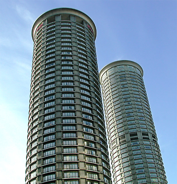
if you focus your eyes on one of the middle windows and then, very quickly, page up and page down the image, it makes you sort of seasick and gives you headache. |
|
| Photographer found comment helpful. |
|
|
06/08/2006 03:54:27 AM |
|
My first impression is that they're leaning and in danger of falling over. With that said, though, I love the buildings. They are definitely very interesting to look at. You also have a great color blue in the sky - mine always seem to come out all white - and I like how it changes to white at the bottom. I like the space between the buildings, and how they are very similar but different in height and the larger band that the one on the right has. |
|
| Photographer found comment helpful. |
Comments Made During the Challenge  |
|
|
01/23/2005 07:38:46 PM |
|
I like it. Repeating elements on a large scale :-) |
|
| Photographer found comment helpful. |
|
|
01/20/2005 02:18:16 AM |
|
Dramatic treatment of high-impact subjects. You chose a very good point of view. 7. |
|
| Photographer found comment helpful. |
|
|
01/18/2005 11:32:22 AM |
|
| Photographer found comment helpful. |
|
|
01/17/2005 05:23:19 PM |
|
I like it. Maybe it would look better if lees of the building was in the shot. |
|
| Photographer found comment helpful. |
Home -
Challenges -
Community -
League -
Photos -
Cameras -
Lenses -
Learn -
Help -
Terms of Use -
Privacy -
Top ^
DPChallenge, and website content and design, Copyright © 2001-2026 Challenging Technologies, LLC.
All digital photo copyrights belong to the photographers and may not be used without permission.
Current Server Time: 06/28/2026 09:09:58 AM EDT.