wow, what a capture. however, i can't help but feel that the image is somehow a little flat. i'm not sure what, but i wish it would pop just a bit more. i hope you're getting some good comments and suggestions, and that you're not getting overlooked in this monster challenge. good luck!
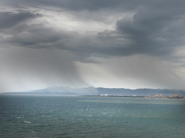
The horizon is a bit tilted and would be better if it would be corrected.
I think some minutes in photoshop could draw more attension to the rain and clouds.
Looks a bit tilted, but you've heard that (and will again). It's actually more the relatively uninteresting subject that lets it down for me. I'm afraid my reaction to it is "Rain? OK, yeah ..we'd better go to the pub then." Sorry to be negative, but it just has no visual impact. 5.
That sky is simply wonderful. It's a shame the foreground does'nt hold the same interest. Additionally the horizon appears a little tilted. I really like the subdued colours here. Good capture. 7
Seems a little grainy and the horizon looks slightly tilted to the right. Might have played a little bit with the colours to add some more anger to the sky and given the image some more punch.






 Add photograph to your favorites
 Add photographer to your favorites


 Photographer found comment helpful.


