CRITIQUE CLUB CRITIQUE
by karmat
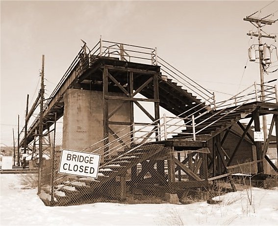
COMPOSITION
I really like how the picture "starts" on the lower left, and takes the eyes up the stairs, back to the left, and then over the bridge. It definitely allows the eyes some movement in the picture, without being overly busy or cluttered. Probably because of the way it is colored, though, the sign becomes the main focal point to me, instead of the bridge. It just kinda jumps out at me.
Would it have been possible to crop the pole out some way? It kinda distracts from the overall quality, I think.
Someone below mentioned moving some to the left. If you could have gotten more of the expanse, in addition to the steps, I think that would have been really effective.
TECHNIQUE
The focus and lighting work well together to give this picture an "aged" look, which suits the subject well.
OVERALL EFFECT
Your composition, and use of sepia, really gives the impression of "CLOSED" here to me, os I think you have done a good job. Some minor things in teh general composition may have made it a stronger picture for more of the viewers, however.
Best to you in future challenges.
karmat |