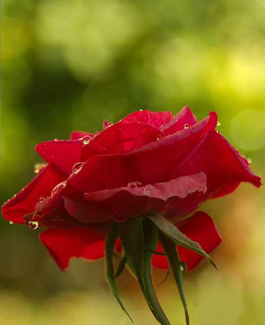
The bokeh and the colors are beautiful!! Compositionally, I think having more space around the rose would bring out the flower a lot more. Also, the lower part of the image doesn't really add so much, most of the action is in the upper part. A horizontal shot rather than a vertical one would probably serve both purposes at once..
Nice bokeh and good color contrast. Good capture of the flower, though light on the flower itself could be more dynamic. However, IMHO the biggest improvement here would come from a different crop--the vertical crop, tight around the flower, shows off the bokeh but doesn't do justice to the flower. Bokeh is supposed to enhance the foreground, make it pop, and thus should sit in the background serving to contrast but not drawing attention to itself.
nice image with a good bokeh--not too much, not too little. the problem with the image is the general composition of your subject. by centering it the way you have, you have created a horizon that is splitting the image in the middle, leaving your bokeh at the top and the under-exposed bottom of the flower below. it's a shame, because the water drops and textures in the lighter areas have a lot of promise. good luck!
While the dew drops might look better if they didn't contain green hues (giving the rose a more ethereal placement) the green background is a complementary colour to the red and balances well.
That's incredibly lovely. Beautiful detail, great bokeh, love the drops of water (dew?), excellent composition, great crop...sorry, I'm gushing, I just really like this.
VERY NICE foreground, very sharp and great colors.
But (to me) it falls short in the Bokeh challenge, the bokeh background does not really compliment the foreground, it is just a color. Maybe a whole field of these flowers in the background would be more effective? I would have given it a 9 with better Bokeh, 7







 Add photograph to your favorites
 Add photographer to your favorites

 Photographer found comment helpful.


