| Author | Thread |
|
|
01/17/2005 07:46:12 AM |
|
He-he, at least I stirred the curiosity of one member - eh Martin (nsbca7). ;-) |
|
|
|
01/17/2005 01:42:58 AM |
Originally posted by glad2badad:
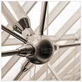
Last day of voting on the Bokeh challenge and STILL discussing bokeh and the various definitions. This has certainly been a hot topic. :-) I'm not proclaiming to be an expert, FAR FAR from it - but I do like to see all sides represented fairly, especially when the subject matter is actively being voted on in a current challenge.
Therefore - here is a definition of bokeh that I find interesting and should be considered by active voters.
The following is an excerpt from What is Bokeh by KenRockwell.
//www.kenrockwell.com/tech/bokeh.htm
 Fig. 1. Poor Bokeh. This is a greatly magnified blur circle showing very poor bokeh. Note how the edge is sharply defined and even emphasized for a point that is supposed to be out-of-focus, and that the center is dim. Fig. 1. Poor Bokeh. This is a greatly magnified blur circle showing very poor bokeh. Note how the edge is sharply defined and even emphasized for a point that is supposed to be out-of-focus, and that the center is dim.
 Fig 2. Neutral Bokeh. This is a a technically perfect and evenly illuminated blur circle. This isn't good either for bokeh, because the edge is still well defined. Out-of-focus objects, either points of light or lines, can effectively create reasonably sharp lines in the image due to the edges of the sharp blur circle. This is the blur circle from with most modern lenses designed to be "perfect." Fig 2. Neutral Bokeh. This is a a technically perfect and evenly illuminated blur circle. This isn't good either for bokeh, because the edge is still well defined. Out-of-focus objects, either points of light or lines, can effectively create reasonably sharp lines in the image due to the edges of the sharp blur circle. This is the blur circle from with most modern lenses designed to be "perfect."
 Fig. 3. Good Bokeh. Here is what we want. This is great for bokeh since the edge is completely undefined. This also is the result of the same spherical aberration, but in the opposite direction, of the poor example seen in Fig. 1. This is where art and engineering start to diverge, since the better looking image is the result of an imperfection. Perfect bokeh demands a Gaussian blur circle distribution, and lenses are designed for the neutral example shown in 2.) above. Fig. 3. Good Bokeh. Here is what we want. This is great for bokeh since the edge is completely undefined. This also is the result of the same spherical aberration, but in the opposite direction, of the poor example seen in Fig. 1. This is where art and engineering start to diverge, since the better looking image is the result of an imperfection. Perfect bokeh demands a Gaussian blur circle distribution, and lenses are designed for the neutral example shown in 2.) above. |
|
|
 Photographer found comment helpful. Photographer found comment helpful. |
Comments Made During the Challenge  |
|
|
01/14/2005 03:36:04 PM |
|
| Photographer found comment helpful. |
|
|
01/11/2005 09:31:47 PM |
|
Nice shot, and you do understand Bokeh! |
|
| Photographer found comment helpful. |
|
|
01/11/2005 11:46:23 AM |
|
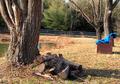
I like the idea here, I do not think though that the white piggy is working very well here (5) |
|
| Photographer found comment helpful. |
|
|
01/10/2005 03:02:25 PM |
|
The piggie is kind of scary. All that change is impressive. Looks like you have some kind of sloping surface that you've piled it on. The busyness of the background does complement the plain white of the piggie well. |
|
| Photographer found comment helpful. |
|
|
01/10/2005 11:25:38 AM |
|
more backlighting i think would have gotten more nice boke. nice idea. |
|
| Photographer found comment helpful. |
Home -
Challenges -
Community -
League -
Photos -
Cameras -
Lenses -
Learn -
Help -
Terms of Use -
Privacy -
Top ^
DPChallenge, and website content and design, Copyright © 2001-2026 Challenging Technologies, LLC.
All digital photo copyrights belong to the photographers and may not be used without permission.
Current Server Time: 06/27/2026 10:24:33 AM EDT.