Greetings from the Critique Club!
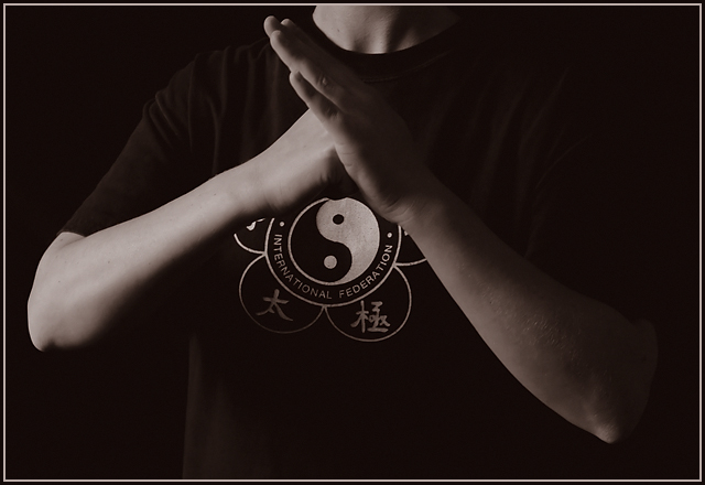
The first thing that strikes me about this picture is the lighting, which is very good. You have a good tonal range without losing your highlights. It could probably stand to be just a bit lighter, to get a bit more definition in the dark areas, mostly, but this is fairly minor.
Brianlh's comment below is definitely a good point- greater symmetry would lend a lot to the solidarity of this image, which would relate well to the title. Also, the focal point of this picture is your hands, which is very close to the top of the frame, Putting it at the 1/3 line would make the composition much stronger.
It looks like you put your hands where you did to show the logo on the shirt, but I'm not sure that it was worth the compositional trade-off. If you had your hands directly over the yin-yang, you might have wound up with the outside elements of the yin-yang forming a sort of corona around your hands, which could have worked out quite well. Seems like this could benefit from a reshoot, just for the sake of seeing how it might come out differently the second time around.
In any case, just keep taking pictures! |







 Add photograph to your favorites
 Add photographer to your favorites


 Photographer found comment helpful.


