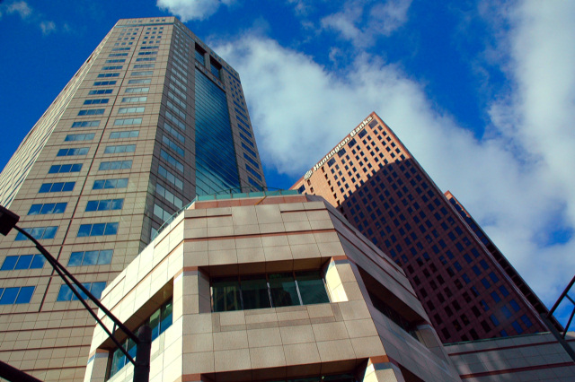
No offence but this looks like a last minute entry to entry a challenge. Perhaps if the center building was level it would have made for a more appealing photo, I also think this photo lacks clarity and is kinda blurry. The silhouette of the street light is also very distracting. Good luck and best of luck in 2005.
interesting image. love all the lines, tones, and colors. i hope you aren't being overlooked in this huge challenge, and that you are getting good feedback. good luck here, and in the challenges yet to come!
Would've been good for the architecture challenge. The composition feels odd to me- I find myself hoping to see some symmetry here where there is none.
I like what you are going for here, you've obviously got a good eye. But there are a couple of things that let you down, firstly that street light is a bit of a distraction, and secondly the shadow cast on the right building is a little too strong. I'd try a closer crop to avoid the streetlight and bring the strong geometry of the image to the fore. Not much you can do about the shadow 'cept shoot at a different time of day.






 Add photograph to your favorites
 Add photographer to your favorites


 Photographer found comment helpful.


