This is a really good version of the original. I agree with what some had said, a sharper angle with a few more boxes might have been nice, but you sure nailed the focus and clarity.
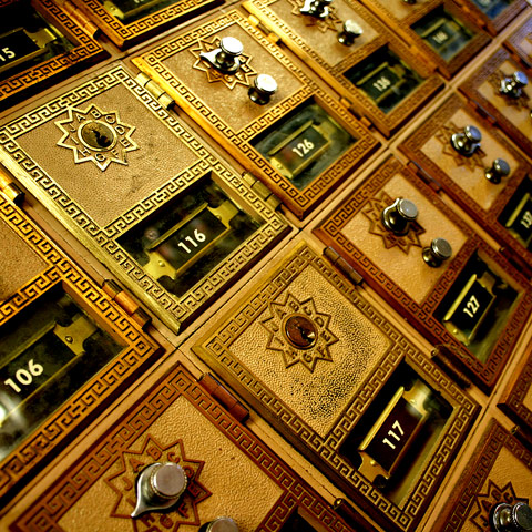
I'm surprised to see the mix of combination and keyed locks. I understand the USPS is phasing out the combo locks ... nice angle to get these in an interesting way.
A very nice image in its own right. Rge original had a diffrent feel because it included many more. I believe this take off to be good because it makes the image different and each one can be appreciated for their own virtues. Bimping up
Personally, I don't care for the crop...I would like to see a bit more mailboxes. Still, I think these are actually better than the original boxes. I like the detail on these. Nicely done.
Those are really terrific mailboxes, the shot however is not either enough of an interesting spin on the challenge winner nor a spot on reproduction to really wow me. If I just saw this in on its own merits I'd probably give it a 7 or 8. As an imitation/adaptation of the ribbon winner its a 5. Good luck!
I have an old post office near me - i thought about doing this one.
Nice shot - I think i like the original a tad more, but only because i have it to compare.
Good strong light, effectively caught. you placing of your depth of field in regard to your composition is also strong - quite a nice shot. Sufferes in comparison with Thamer's original, if only in sheer sense of scale, but I like what you gain in detail.







 Add photograph to your favorites
 Add photographer to your favorites


 Photographer found comment helpful.


