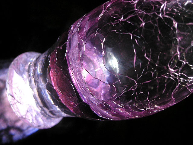
First a beautiful subject with lovely color. A very strong diagonal composition with a great fractured glass pattern. The lighting could be improved some what with bounce light and avoid the two glares of which the larger on the left is most obvious.
Question: how can an image with good subject and beautiful color score so low? Well, the answer is simple: the image attracts the eyes but then the rewards for scrutiny are missing. The glare or burn outs do not help and the shallow dof leaves the viewer wanting.
Despite this, it is certainly a good effort because with a little more attention and time you could have looked at the results here and say wait, let me do whatever to close the lens to increase the dof. Even changing the angle, a side shot could have done this but the angle you have here works and so closing the lens is the only way out. Next, you have observed the strong light. Even if you do not have studio lights you can light this to your satisfaction with regular household lights.
To conclude, you are on the right track and lacking just a little more tweaking to have created an image that not only attracts but rewards the looker. Your next effort will be even better.
I didn't like this. To me it was too confusing (too close for me to see what it is clearly). I also didn't like the giant glare off to the left. I do on the other hand like the colors you were able to get.






 Add photograph to your favorites
 Add photographer to your favorites


 Photographer found comment helpful.

