| Author | Thread |
Comments Made During the Challenge  |
|
|
12/21/2004 11:14:02 PM |
returning for comment:
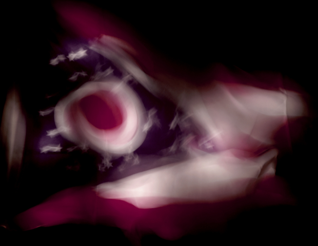
A very good capture. Perhaps too artistic for the taste of DPC, but all the same you have blessings. The abstract feel gives it the hint of an animals' face with open eyes and pursed lips. Bumping up. |
|
 Photographer found comment helpful. Photographer found comment helpful. |
|
|
12/21/2004 08:23:26 PM |
This photo shows wind/movement, but its a rather shocking photo that it lacks any quality. It just seems like a blurry photo, nothing is clear or sharp in it.
|
|
| Photographer found comment helpful. |
|
|
12/21/2004 04:06:35 PM |
|
Good idea, however the effect is overdone to the point where the image is too distorted and distracting. Good luck. |
|
| Photographer found comment helpful. |
|
|
12/20/2004 02:37:40 PM |
|
I think the movement effect is overdone, at least for my taste. |
|
| Photographer found comment helpful. |
|
|
12/19/2004 11:01:29 PM |
|
| Photographer found comment helpful. |
|
|
12/17/2004 02:50:52 PM |
|
Knowing how DPC'ers vote around here, I would imagine that this isn't scoring very well. I personally like the abstract-ness of this picture. Nice work. |
|
| Photographer found comment helpful. |
|
|
12/15/2004 10:01:36 PM |
|
| Photographer found comment helpful. |
|
|
12/15/2004 06:18:26 PM |
|
Good idea in theory but not a picture I'd like to hang on my wall. A little dark and the motion blur seems to detract from the image, rather than adding to it. |
|
| Photographer found comment helpful. |
|
|
12/15/2004 02:47:36 PM |
|
Hmm... pretty blurry to me... its flag or something... just nice colors. |
|
| Photographer found comment helpful. |
|
|
12/15/2004 02:03:14 AM |
Composition: 4, Technical: 3, Appeal: 4, Challenge: 6, Overall Calculated Average Score: 4
Between the darkness and motion blur, no appeal to me. |
|
| Photographer found comment helpful. |
|
|
12/15/2004 12:41:17 AM |
|
Out of focus can be a great tool, but unfortunatly I don't see a reason here. Sorry. |
|
| Photographer found comment helpful. |
Home -
Challenges -
Community -
League -
Photos -
Cameras -
Lenses -
Learn -
Help -
Terms of Use -
Privacy -
Top ^
DPChallenge, and website content and design, Copyright © 2001-2026 Challenging Technologies, LLC.
All digital photo copyrights belong to the photographers and may not be used without permission.
Current Server Time: 06/29/2026 09:18:55 PM EDT.