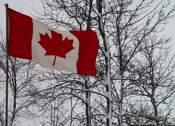
There is not much latitude with images like these so it follows that the main essentials be above reproach. However, let us first explore the positive aspects of this shot. It is for a wind entry and it is a very good one because look at the position of the Canadian flag. it is stretched out right before our eyes. This meant capturing at this moment of billowing. So the take is on the money. Next: the composition. Here it starts at upper left and sweeps down at a comfortable angle. The trees and the snow make for, besides a cold windy day, an interesting backdrop of branches and windward snow that clinges gracefully to the sides of the branches. All in all, a very good capture with the classic colors of white, red and black(the shadows). All is fine in these departments.
Its only drawback is the color balance. There are grays that should be white. Even after a color correction which can be done with levels, there is the final tweaking to make the image sing. Again, a basic levels adjustment would do just fine. It is better to use levels than the auto contrast and it is better to use curves than levels, but levels well employed would be effective enough.
To conclude a very nice image which merely lacked the final touches. I have looked at your port and I am very impressed with many of your images. You have a very good eye and employ your imagination wisely.
NIce contrast with the colors of the flag against the snowy background. It was a good choice to go for trees in the background rather than the plain white snowy sky. It is almost ironic that a leaf is depicted on the flag while none remain on the trees. I am voting this one a 7. (6 is average on my scale.)
First, I think this may be a bit underexposed, the snow looks really grey to me, and the white of the flag loos grey too. Secondly, this cropping leaves a very unbalanced feeling to me. The red is so dominant it needs to either cropped tighter to be almost all red, or wider, so there is enough background to provide some balance.







 Add photograph to your favorites
 Add photographer to your favorites

 Photographer found comment helpful.


