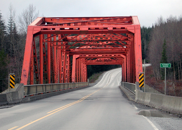
this view is rather imposing. i can't tell if you pushed the saturization or not, but if this is the way it looked when you shot it, the image would be stronger if you had backed up about 50 steps. the red just eats the frame.
i didn't know this bridge was red, either. i could sworn it was a steel-gray. just goes to show, you can't believe what you see...
My first thought here is to wonderr why you shot this from this point fo view: it seems to me thhat it doesn't allow us much sense of the bridge at all. The head-high shot means that the intricacies of tthe 'roof' are squeezed into very little space in your shot, and your angle to the thing means thhat the sides are similarly stuck for space - there's almost more road here than brisge, and yet you haven't given much impression of where it is at all - a bridge over what? How big is that river? How deep is the drop? There's a strong sense of the bright colour of it, and that is well done, and the overall exposure is good - low enough for the colour to pop, but not so as to lose detail. Some experimentation with angles would help I think - even getting down on one knee to shoot can give an image just that bit of difference it needs to stand out. Good luck.
I like this one, especially since I suspect that no desaturation was needed for this shot, and yet the color of the bridge is outstanding. I'm not sure how much of a busy street this is, but I would have preferred if you'd taken this shot from the middle of the road. That way you might have avoided that puddle on the right that is just a distraction.







 Add photograph to your favorites
 Add photographer to your favorites


 Photographer found comment helpful.


