| Author | Thread |
Comments Made During the Challenge  |
|
|
12/12/2004 02:50:16 AM |
|
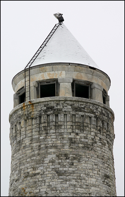
very unusual and interesting a bit stark in the background I think this would look nicer against a dark b/g good detail in the brickwork |
|
 Photographer found comment helpful. Photographer found comment helpful. |
|
|
12/09/2004 04:56:11 PM |
|
reminds me of a chess piece. The top blends int o the sky. more contrast? |
|
| Photographer found comment helpful. |
|
|
12/09/2004 02:52:02 PM |
|
I like the neutral tones of this photograph. Good composition. Perhaps I would have liked to see just a little bit more of this tower. |
|
| Photographer found comment helpful. |
|
|
12/08/2004 08:28:03 PM |
|
| Photographer found comment helpful. |
|
|
12/08/2004 05:49:48 AM |
|
nice shot, clear and sharp |
|
| Photographer found comment helpful. |
|
|
12/07/2004 01:20:20 AM |
|
Not too bad. The top looks a bit blown out but the structure looks great. |
|
| Photographer found comment helpful. |
|
|
12/06/2004 06:57:42 PM |
|
The composition is a little uninteresting here - much too centred - and you have provided no context for viewers to place the landmark in. I think this might have been better if you had included some of the surrounding landscape so as to give that context. Anyway, it's still a solid attempt - focus etc is good. Best of luck. |
|
|
|
12/06/2004 01:22:19 AM |
|
Could use 1/2 to 1 stop more exposre - a bit washed out, especially the roof against the sky. A bit dull composition wise - just a pic of a tower. It 'says' nothing. |
|
Home -
Challenges -
Community -
League -
Photos -
Cameras -
Lenses -
Learn -
Help -
Terms of Use -
Privacy -
Top ^
DPChallenge, and website content and design, Copyright © 2001-2026 Challenging Technologies, LLC.
All digital photo copyrights belong to the photographers and may not be used without permission.
Current Server Time: 06/29/2026 10:06:21 AM EDT.