|
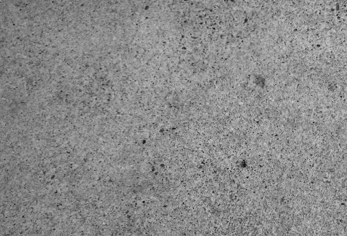
I think all the extra negative space would have worked better if it were smoother and with less contrast. The dark specs seem to almost hide the subject. Also, it looks like about half of the surface is out of focus. I think in this case you would have done better by cropping in allot more there by getting rid of the blurry surface. |




 Add photograph to your favorites
 Add photographer to your favorites


 Photographer found comment helpful.


