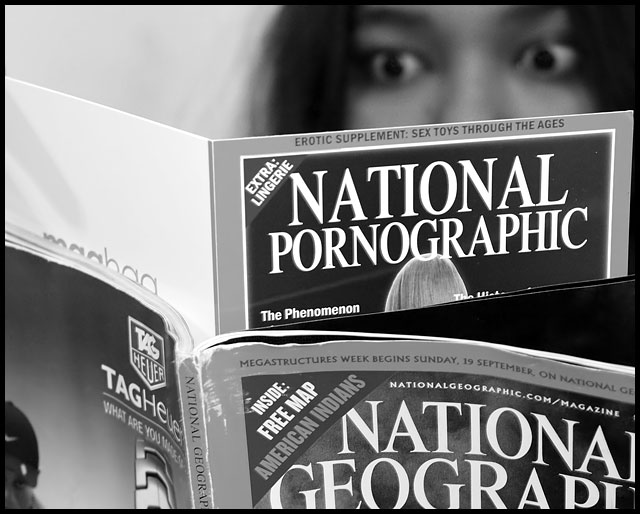
What's inside National Geographic is a card I got from a friend good friend on my Birthday. Hard to use it for a challenge.
Processing:
# Adobe Photoshop
- Curves for contrast
- Channel Mixer for monochrome
- NeatImage to hide the grain visible from ISO 640
- Resampled and applied Unsharp Mask.
- Added Border :)
Statistics
Place: 44 out of 155 Avg (all users): 5.6875 Avg (commenters): 7.7333 Avg (participants): 5.7159 Avg (non-participants): 5.6591 Views since voting: 1423 Views during voting: 320 Votes: 176 Comments: 15 Favorites: 1 (view)
Interesting concept, but it seems a little heavy-handed. I don't like the use of National Geographic magazine as the foil because it seems a shade too much like you are using it as a parallel, and I happen to love National Geographic. To me it seems out of synch with the times because we are moving toward era of censorship and away from any type of freedom of expression.
Great expression on your subject's face and nice composition.
Meets the challenge in a delightfully creative way, with excellent lighting and composition. The model's face adds just the right spark of interest and humor. Well done comment on time and change. Also - perfect DOF.
This image is on the money with great expression and the changes in time where such a publication reduces itself to catch the beat that need not be really addressed. more of a playboy topic. great message. You have my 9







 Add photograph to your favorites
 Add photographer to your favorites


 Photographer found comment helpful.


