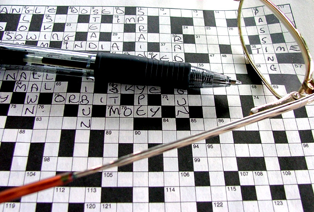
Aside from meeting the challenge by the straightforward expdient of putting the words in the shot - and the more genuine sense of the challenge by it being a shot of a crossword - I find this a slightly uncomfortable image. The differentiation between whites and greys seems overly definite, rather than progressive, and your composition places odd things in the strong areas of frame - the 'passing time' is releggated from visual interest by being so far toward the edge. I think many voters will simply see a crossword shot.
Meets the challenge but to me it feels weak in composition. You've done a nice job with focus. and I tend to like shallow depth of field, although voters here seem not to. Levels could use some work. A bit greater saturation of the glasses might add a bit of pizazz. In the end, I am handicapped because I consider crossword puzzles a waste of time and I therefore don't find the subject all that interesting. I am sure there are uses for this in Stock Photos where the meaning is added through combining the photo with other content. Sorry to seem negative.
Great idea. I would have gotten rid of the glasses, used a contrasting colored pen and let the image speak for itself. A more powerful focal point would tighten the message for me.
MOEY?? You're not allowed to just make up words to fill in the gaps!!!
(my dictionary says it doesn't exist, but maybe it means something where you are)
Very good pic though I bet a lot of people don't even notice "passing time" on the puzzle, even with the title as a hint






 Add photograph to your favorites
 Add photographer to your favorites


 Photographer found comment helpful.


