| Author | Thread |
|
|
11/27/2018 05:22:13 PM |
|
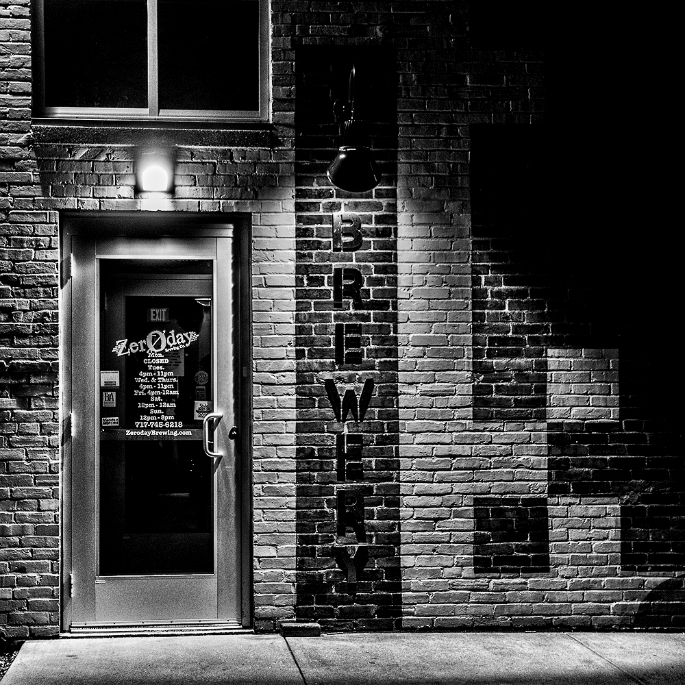
I like both versions. The original has more mood, this one more impact as a graphic design. It has a solarized appearance. |
|
 Photographer found comment helpful. Photographer found comment helpful. |
|
|
11/25/2018 08:01:09 AM |
|
A lot of nice details to keep the eye circling. Works well in strong b&w. |
|
| Photographer found comment helpful. |
|
|
11/24/2018 08:22:21 PM |
|
I like this better. your mileage may vary! |
|
| Photographer found comment helpful. |
|
|
11/23/2018 11:12:39 PM |
|
I find myself liking both versions equally :) - the b&w really gets at all the juicy detail and contrasts, while the color seems to evoke more of a mood and sense of place - it's a matter of emphasis |
|
| Photographer found comment helpful. |
|
|
11/22/2018 01:47:18 PM |
|
I'm voting for the colour version, it seems a more fun and inviting image :) |
|
| Photographer found comment helpful. |
|
|
11/22/2018 10:52:14 AM |
|
Interesting our reactions after having in memory the color version. Each version is interesting in a different way. Here the pitch black windows are the villains and in their blind way seem to cast a foreboding shadow |
|
| Photographer found comment helpful. |
|
|
11/22/2018 09:33:55 AM |
And I prefer the black and white :) I think the light over the door is nicer here. Not sure about the interior (esp EXIT and the sign below it) - it certainly recedes here but I haven't decided yet whether I think that's good or bad.
Message edited by author 2018-11-22 09:34:34. |
|
| Photographer found comment helpful. |
|
|
11/22/2018 08:52:57 AM |
|
Personally, I prefer the color original. This black and white conversion strikes me as too contrasty, whereas the colors in the original were quirkily harmonious. The mood in the original is more welcoming, but all this is certainly a matter of personal artistic vision. |
|
| Photographer found comment helpful. |
Home -
Challenges -
Community -
League -
Photos -
Cameras -
Lenses -
Learn -
Help -
Terms of Use -
Privacy -
Top ^
DPChallenge, and website content and design, Copyright © 2001-2026 Challenging Technologies, LLC.
All digital photo copyrights belong to the photographers and may not be used without permission.
Current Server Time: 07/05/2026 06:45:08 AM EDT.