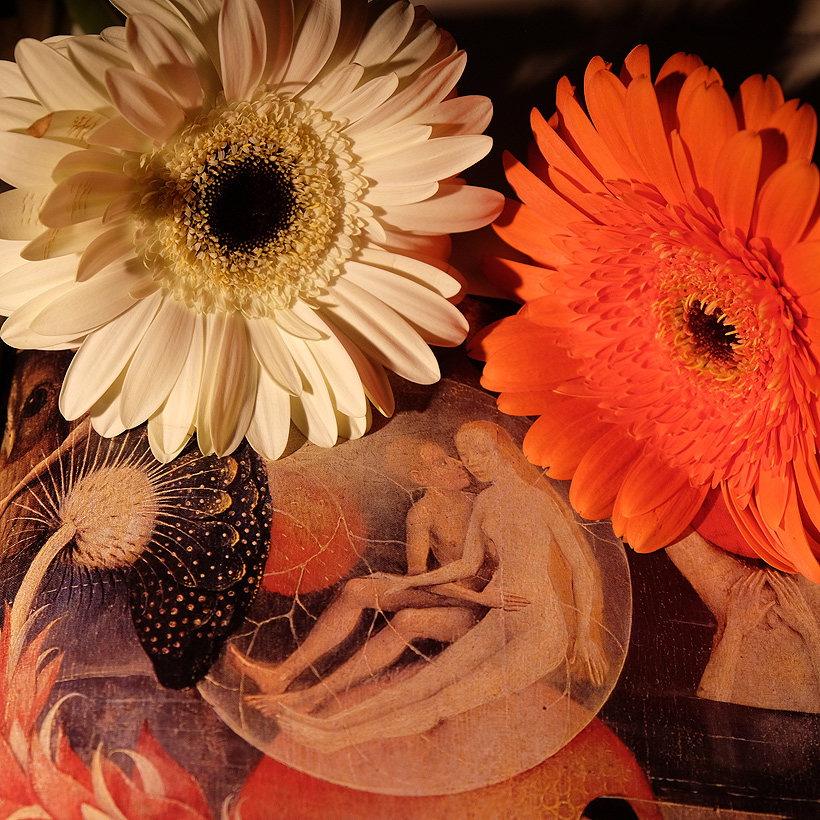
The color palette, how the flowers match the Adam and Eve art, is what I find interesting. The purity of white juxtaposed with warning, caution, and danger of orange. That's temptation. Works well square too!
My eye flowed downward in this image. It began with, "oh no, a couple of flowers," but as I completed the visual journey I admired the creative, modulated and harmoniously toned result. The medieval illustration, perhaps of fertility and/or love, is an allegorical blossom or bud of a different order, but tied into the upper flowers. The moon and sun of the "real" flowers are echoed below on the upper stem and just inside the veined, globe-like bud. The upper flowers are subtly angled to look at the couple. It's a still life with a twist, and that allusive twist makes all the difference. Elegant and, did I mention, creative.
Am guessing by the title that is Adam and Eve? Is it just my mind or is that a rude picture bottom right? And, is that a duck on the left? Lovely Gerbera :)
Great composition. I'd have liked to see a little more definition in the orange/red petals at the center. I really like how you matched the flowers perfectly to the picture underneath. If I were doing this, the only available flowers would be purple or bright pink.




 Add photograph to your favorites
 Add photographer to your favorites

 Photographer found comment helpful.


