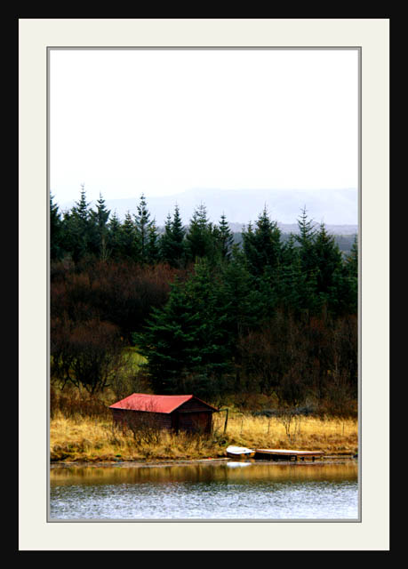
Despite that frame, which is actually only distracting for me when one remembers to consider it, i rather like this image. You've captured that high white sky feeling of autumn without resorting to the usual medley of burnt orange colours, yet indisputably this is an autumnal image. it has that sense of peace, of the beginnings of rest after the rush and hurry of the glory of summer. Very good work.
Looks like you have treated it like a gallery challenge. :)
I like the image, but the framing is taking away the detail because the image itself is small. I would like to see a bigger version of it.
I liked the overall photo but thought the sky was too washed out and my eyes get pulled to the white there instead of the green, red, and yellows below.
Honestly this is the best image in the challenge so far, but honestly the frame distracts so much, it ruines it. I'm not going to cut points for that, others will I'm sure, but please for your own sake use more discrete frames in the future. The image is amazing like a classic painting.
Way to much of a border. The actual picture gets too small and loses impact. That was potentially an 8 without that overwhelming border. A split neutral density filter could have helped increase the saturation in the sky while exposing the tress and house properly.
whoa! easy on the border!
nice image, can clearly see it as a calendar, wish that I could look at the image without the border getting distracting so much though
I rarely comment on a person's borders, but this one just overwhelms what could have been a beautiful photo. I would have rated it higher without the frame/border.
the frame is too heavy. realy distracts you from the image.
Usually I do -1 for a bad frame but you get -2 for the frame.
With there where some detail left in the sky but its all just washed out.
This picture seems very interesting and nice. Unfortunatly, because of the "very big" frame, we do not see much of it. The colours look really rich, while the sky could've used some work.
As a recommendation, i would propose to remove the frame completly, and just add a little framing line, a few pixel-distance from the actual picture (black background) with a nice golden colour. This would bring out a lot more of the image.
An unwriten rule of framing: Never use the dominant or most 'foreground' colour as a frame display. Go with the soft and unique colours. (in your case, yellow, green or Red would've probably given more punch).






 Add photograph to your favorites
 Add photographer to your favorites


