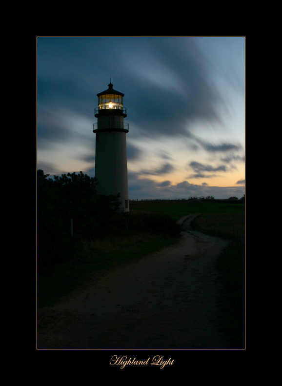
It's dark, and it's beautiful. The road is there, fore to back. The lower window in the tower is easy to make out. The highlight exposure is gorgeous. And we've been spared undue saturation. (Smiling)
The horizon appears to tilt, just a teeny-weeny bit, to the left. The border is, well, ominous, overpowering and, to my senses, painfully ostentatious.
The centred horizon, although against the blanket rules of composition, works well enough. The resulting two 'halves' of the image are balanced: the dark reflecting the light, more or less symmetrically. Road and lighthouse enjoy an equal correspondence of 'relative weight', assymmetrically.
The rule for those who know the rule: do it the way the image dictates. |