| Author | Thread |
|
|
04/26/2003 06:18:55 PM |
|
|
|
02/14/2003 05:26:38 PM |
Greetings from the Critique Club!
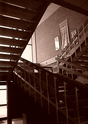
COMPOSITION... I find this area can be improved upon somewhat, depending on what kind of picture you are going for in the end. For an interesting abstract of stairs, I would try getting in closer and looking for a pattern in all those angles. Try a couple of different viewpoints and see what turns out. If you are trying to take a more pulled-back shot, i would choose another angle that obscures any distracting elements in the photo. For instance, the posters on the wall detract my attention from the shapes of the stairs. Actually, I think this is the only major distraction in this shot - Imagining what the photo would look like compositionally without these posters produces pleasing results. Also the photo is slightly tilted - you can use Photoshop's crop tool whenever you see your photo is slightly angled.
TECHNIQUE ... I'd only be repeating what's in the comments already here - I do find there is just too much shadows in the photo. I like the sepia look to the photo - regular color might have made it a bit too run of the mill. Anyway, overexposing the photo a little more would solve the shadow issue, or as Olyuzi suggested, using reflectors or firing your flash could have also solved your problem.
OVERALL.. A very good first attempt. Welcome to DPChallenge!.. hope you enjoy taking part in future challenges!... |
|
|
|
02/10/2003 10:34:03 AM |
|
The bright door (bottom left) makes the whole image appear to be twisted, try stepping left to get it out of frame and maybe it'll allow a bit of detail in the dark area to come through. I like the shapes and the contrast in light-top dark-bottom. |
|
Comments Made During the Challenge  |
|
|
02/05/2003 12:24:11 PM |
|
Very interesting composition. It seems that the picture to be underexposed lacking in detail in the bottom steps and under the bottom steps and I believe that it takes away from the energy of the picture. I would prefer more detaiil there. This could have been done by exposing for the shadows or with either fill lighting or reflectors. |
|
|
|
02/05/2003 03:01:24 AM |
|
Nice subject, but looks almost accidental. |
|
|
|
02/03/2003 08:39:18 PM |
|
 Photographer found comment helpful. Photographer found comment helpful. |
|
|
02/03/2003 02:33:40 PM |
|
i like the way you used the stairs to frame the brick wall! i also like the way the light lights the way and darkens the stairway! good job! |
|
| Photographer found comment helpful. |
|
|
02/03/2003 01:32:58 PM |
|
i really dont like it....its to dark around the base, you smell!!! |
|
| Photographer found comment helpful. |
Home -
Challenges -
Community -
League -
Photos -
Cameras -
Lenses -
Learn -
Help -
Terms of Use -
Privacy -
Top ^
DPChallenge, and website content and design, Copyright © 2001-2026 Challenging Technologies, LLC.
All digital photo copyrights belong to the photographers and may not be used without permission.
Current Server Time: 06/28/2026 08:39:47 PM EDT.