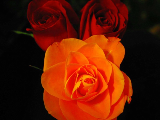
Should've concentrated on the roses. They photograph better than almost every othe flower. The background roses are also a little dark as well. - Inspzil
These roses do not look the same color, but I could be wrong. The two from the side in the background appear read and the main one looks orange or dark peach. This is disturbing and distracting. Also the 2 read ones are buds and this one appears opened up. Part of each flower was cropped off by doing such a tight crop. I feel they should have been left whole. The open rose is a very soft focus, as soft as the other 2. With them in the background I feel the main one should be brighter as yours is but also sharper focus. To me the only difference appears to be the amount of light. But I could be wrong. Pretty roses anyway.
Wow! Another danm flower. . . I like it. You've captured lovely color here with your camera. I like your dark background - nothing to distract me. The Red roses are very nice against the Orange, and the Green of the stem leading off from both is a nice touch as well. The orange petals look very fragile with the lighting that you've given them. Nicely done.




 Add photograph to your favorites
 Add photographer to your favorites


 Photographer found comment helpful.


