| Author | Thread |
|
|
11/08/2004 07:42:59 PM |
Howdy from the Critique Club!
Been getting some CC's from you and whattaya know but i get to do yours!
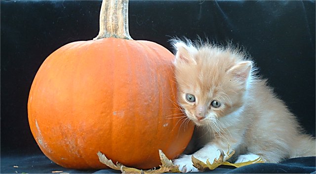
As for this shot---well, you really achieved the cuteness factor! What a fuzzy, cute subject! This one is a great model and would be fun to work with. I really like how you included the pumpkin in this shot. Even though it is obviously a fairly small pumpkin, it still seems to tower over your subject, giving it even more of an emphasis on the helpless expression that your subject portrays. The leaves also add a good sense of the season and balance with the pumpkin well.
As for criticism, this is what i have: I feel that you might have slacked off when it comes to editing this. I think that a clean black background would have lessened the distraction from the subject. Using the cloning brush and the levels tool, you could have easily made a seamless background out of this. I also feel that you could have clones out some distracting debris in the bottom right part of the image as well as on your backdrop.
Compositionally, i feel that there are a couple of problems. Firstly, I feel that both the top and the bottom of the image seem to have been chopped off. It is a little bit too crowded at the very bottom and I feel that there needs to be some breathing space above the pumpkin stem. The placement of the kitten is right on though as well as its pose.
Lastly, I believe that there might be a slight blue cast to the image which again could have been fixed in the post-editing process.
Overall, I find this a charming and very cute image. I feel that it was underrated, but I also do believe that some of my suggestions may have helped out the image. Still a very good and modest submission. I personally rated it an eight purely by the way it made me feel. Whenever a photograph truly makes me feel a way, then to me it must be a very good image. Thanks for submitting and also for commenting on my images :).
If you have any questions, comments, or concerns feel free to contact me. Hope this CC wasn't TOO long!!!
Thanks,
Lee |
|
 Photographer found comment helpful. Photographer found comment helpful. |
|
|
11/08/2004 01:39:17 AM |
|
This was a cute entry. I love it. |
|
| Photographer found comment helpful. |
Comments Made During the Challenge  |
|
|
11/06/2004 11:59:41 AM |
It is indeed very cute..
Compositionally,I would have liked to have seen this cropped tighter to show only half the pumpkin and a closer take on the kitten but that`s just my personal preference...great lighting and nice clutter free background.
Well done. |
|
| Photographer found comment helpful. |
|
|
11/06/2004 10:08:57 AM |
|
| Photographer found comment helpful. |
|
|
11/05/2004 02:23:36 AM |
|
| Photographer found comment helpful. |
|
|
11/04/2004 04:28:25 AM |
|
more contrast would help here, it's a nice image all around. nice kitty too |
|
| Photographer found comment helpful. |
|
|
11/03/2004 10:13:34 PM |
|
I agree. Nice orange cat to put with the leaves and pumpkin. The wrinkles at the top are the only distraction for me. Otherwise nice shot. |
|
| Photographer found comment helpful. |
|
|
11/03/2004 06:26:19 PM |
|
| Photographer found comment helpful. |
|
|
11/02/2004 06:22:29 PM |
|
Definitely a awwww picture! I would have focused on the kitten a bit better tho. |
|
| Photographer found comment helpful. |
|
|
11/02/2004 02:52:54 PM |
Awwwww TooCute....
No realy... I like it. |
|
| Photographer found comment helpful. |
|
|
11/01/2004 09:55:19 AM |
|
Lovely image though the title is very weak. Feels crowded at bottom - could do with extra black material to distance subjects from lower edge of frame. Not keen on way that pumpkin stem leaves the frame at the top. Might work better if it were cut shorter and fully enclosed within frame. |
|
| Photographer found comment helpful. |
Home -
Challenges -
Community -
League -
Photos -
Cameras -
Lenses -
Learn -
Help -
Terms of Use -
Privacy -
Top ^
DPChallenge, and website content and design, Copyright © 2001-2026 Challenging Technologies, LLC.
All digital photo copyrights belong to the photographers and may not be used without permission.
Current Server Time: 07/02/2026 08:37:47 AM EDT.