Hello from the Critique club
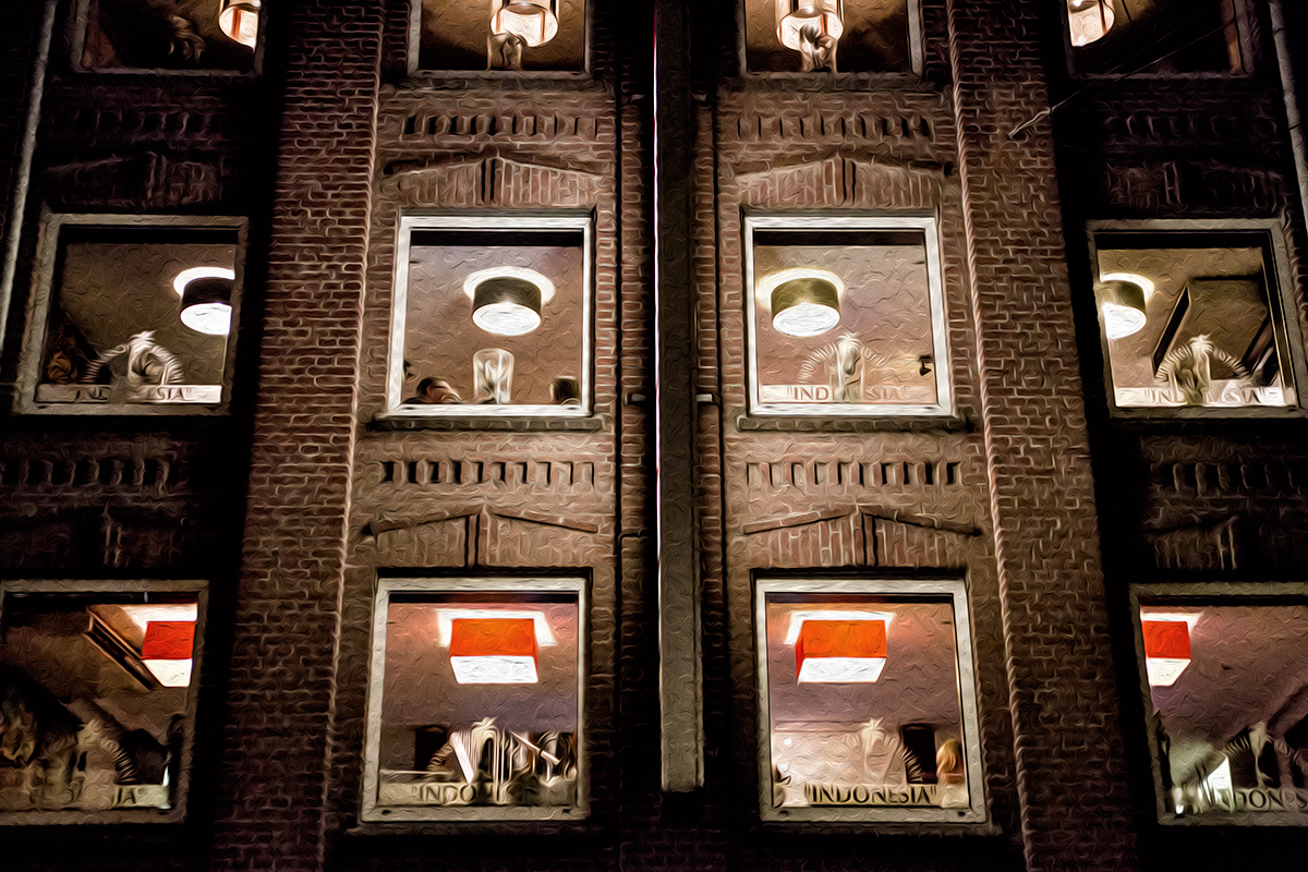
An interesting image that meets the challenge
Well done for spotting the potential from this scene to create something quite unique. The red lampshades are very distinctive in this near mono sepia image, I also like their contrasting square shapes against he round ones above. Your symmetry is pretty near spot on and well justified for the image here. The one criticism I am tempted to make is the vertical cropping, I wish we could see more of the upper windows and lamps, this could have been done with a little sacrifice of the bottom of the frame which I feel is less important than the top of the frame. I am not keen on these 'artistic' PS filters but I can fully understand why you have chosen to use them in this challenge.
Thanks for your original entry |





 Add photograph to your favorites
 Add photographer to your favorites

 Photographer found comment helpful.


