returning for comments:
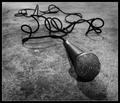
The famous baton. it is not quite over a conductor's score, but very well placed handle at the decressendo and approaching the piano. Bumping up on composition.
Nice effort and the composition is ok, although I do get the feeling the baton in question seems glued to the paper, the orientation looks forced. The light source seems to be placed to close to the subject washing out colour and detail down to the left. The light areas draws the eye away from the subject a bit and it seems a bit unnatural that it comes from below.
Baton's aren't used in piano music; would have been more effective with an orchestral score...but I suppose that's a technicality. Otherwise, good angle, pretty good DOF, I wish for a little less glare at the lower-right, distracts from the line of the baton.






 Add photograph to your favorites
 Add photographer to your favorites


