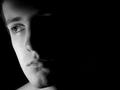
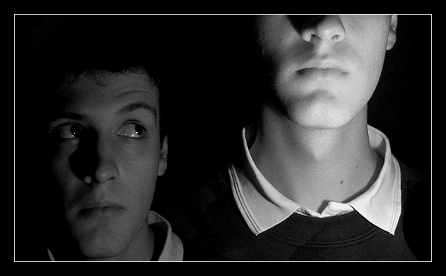
Mini-Me is darker because he is "in the past", and not in the limelight so to speak, and he looks a little puzzled. I used all-round lighting on him, so that the features would appear soft and younger.
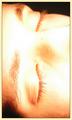
Mega-Me has harsher lighting to make the features bolder and more "adult-like". I also lit him from below so that the height is exaggurated, and lighting from below also gives a feeling of power to that character.
Hmm why did I just type that all in the 3rd person? I guess it was easier to explain that way :)
Statistics
Place: 17 out of 64 Avg (all users): 6.0938 Avg (commenters): 6.9091 Avg (participants): 6.0392 Avg (non-participants): 6.1556 Views since voting: 6247 Votes: 96 Comments: 12 Favorites: 4 (view)
I don't get it. I thought this was one of the top most creative shots in this challenge. Lighting, focus and contrast all seem totally top notch! It completely fits the challenge. Arrggghhhh.
This is nice. I love the rich black and white tones. However, I'm not sure if your dramatic lighting and composition really suit the subject matter. In another context, this would have been really cool, but just to show the effect of a growth spurt... it seems like you're subverting your theme for humorous purposes, but it doesn't quite work.





 Add photograph to your favorites
 Add photographer to your favorites

 Photographer found comment helpful.


