| Author | Thread |
|
|
02/07/2003 10:40:46 PM |
Critique Club Assignment :
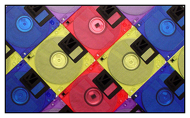
Composition - My eye travels everywhere in this photo.. coming to light.. not totally rest... on the yellow disks. I like how the details are repetetive, in a pattern, but the colors are not totally in the pattern because it makes my eye search for it more than if it were completely obvious.
Technical - Could be a bit more crisp. It feels over sharpened in post processing rather than sharp at the get go. Lighting is excellent. No glares, and it is even across the image.
Overall - I like this image in general, and it is attractive to look at. The colors would grab me more and make me stay if they were more vibrant, and the image crisper. Good job overall!
|
|
 Photographer found comment helpful. Photographer found comment helpful. |
Comments Made During the Challenge  |
|
|
02/02/2003 11:25:01 PM |
|
I've never seen diskettes like this. Interesting abstract. I think it could use a little more contrast to make the colors pop more. |
|
| Photographer found comment helpful. |
|
|
02/02/2003 08:04:59 PM |
|
I like the composition and the colors. Nice photo. |
|
| Photographer found comment helpful. |
|
|
02/02/2003 07:37:35 AM |
|
Great vibrant colours. I like your idea of composition and using all of the frame to create this effective outcome. Excellent work and GL |
|
| Photographer found comment helpful. |
|
|
02/02/2003 12:13:13 AM |
|
I think this is the best of all the disk shots! I love the pattern and the colours. |
|
| Photographer found comment helpful. |
|
|
02/01/2003 11:39:19 PM |
|
| Photographer found comment helpful. |
|
|
02/01/2003 12:54:01 PM |
|
| Photographer found comment helpful. |
|
|
02/01/2003 11:45:29 AM |
|
Wow, can't believe there's another shot with disquettes this week. I like this one better, more orgainzed and clean. Good job. jacko. 8 |
|
| Photographer found comment helpful. |
|
|
01/31/2003 02:21:38 PM |
|
The colors of this photo are nice. I like the way the disks are placed. |
|
| Photographer found comment helpful. |
|
|
01/30/2003 11:36:14 PM |
|
Great colors and use of symmetry. The angle also helps give the picture "motion" and dynamics. |
|
| Photographer found comment helpful. |
|
|
01/30/2003 03:15:05 PM |
Composition: Good
Technical: Over sharpened? Looks like border was added before sharpening, hence light line inside the black border.
Meets challenge: Yes
Overall impression: Hard to fault aesthetically, and minor tech issues. 8 |
|
| Photographer found comment helpful. |
|
|
01/30/2003 02:44:18 PM |
|
Good subject. ..although the concept was to be of squares and I can clearly see circles as well. Very creative. |
|
| Photographer found comment helpful. |
|
|
01/30/2003 01:09:29 AM |
|
I like the way these are arranged to make a diamond pattern. |
|
| Photographer found comment helpful. |
|
|
01/29/2003 08:50:35 PM |
|
More diskettes - not a lot of originality. |
|
| Photographer found comment helpful. |
|
|
01/29/2003 05:09:29 PM |
|
lots of squares. circles take away from the theme. |
|
| Photographer found comment helpful. |
|
|
01/29/2003 02:16:51 PM |
|
I really like the pattern on colors that you used on this picture. I think that have it in a pattern really helped bring the attention to your image. I think that if you would have used less cases and moved in closer it would have more intrest. |
|
| Photographer found comment helpful. |
|
|
01/28/2003 11:33:38 PM |
|
Nice abstract. I like the angle you used. Good job. |
|
| Photographer found comment helpful. |
|
|
01/28/2003 02:43:34 PM |
|
Intresting choice to use disks, good colors. |
|
| Photographer found comment helpful. |
|
|
01/28/2003 12:29:21 PM |
|
| Photographer found comment helpful. |
Home -
Challenges -
Community -
League -
Photos -
Cameras -
Lenses -
Learn -
Help -
Terms of Use -
Privacy -
Top ^
DPChallenge, and website content and design, Copyright © 2001-2026 Challenging Technologies, LLC.
All digital photo copyrights belong to the photographers and may not be used without permission.
Current Server Time: 06/29/2026 06:13:16 PM EDT.