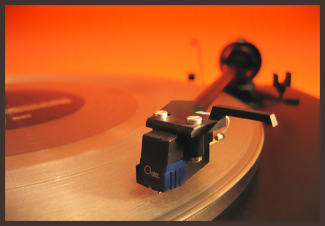
I saw a similar shot somewhere in this challenge but this one is so much better, the other one was almost black. Anyway, great shot, great angle and I love the colours in this one.
Processing has given it a computer generated feel which is either too much or not enough. To give it more of a 'poster art' feel I think you need to remove the distractions in the background (e.g central black square blob and stylus arm rest) to keep it to just the bare essentials






 Add photograph to your favorites
 Add photographer to your favorites


 Photographer found comment helpful.


